(This article and its companion, "Uniformity, Variety and the Beauty of Polygons" significantly overlap because each was submitted separately to different conferences the peer reviewers for which were not privy to the other paper. Endnotes, marked in boldface in the text, appear at end of the document but may be accessed by clicking on the number; return to text by clicking "back".)
1
Eighteenth Century British aestheticians make much of the formula: uniformity amidst variety. Or at least Hutcheson and Gerard do. These terms do not stand entirely alone. They are accompanied by such others as "simplicity," "complexity," "intricacy," "proportion" and "order." "Beauty," says Gerard, "belongs to objects possessed of uniformity, variety and proportion. Each of these qualities pleases in some degree; but all of them united give exquisite satisfaction." (Gerard 29) Occasional efforts to produce clear statements of their meaning are made, but never with the persistence the subject demands. Applications are also made, most extensively by Hutcheson. But these too leave all too many questions unanswered. The result is that these fundamental concepts are shadowy, and the aesthetic theories in which they play a role are correspondingly nebulous
Little better can be said for references in more recent times to unity and complexity, as in Beardsley's now-classic texts. The interrelations among these terms, and their logical grammar, are unclear. Applications are incompletely documented. Work needs to be done, since everyone agrees that both unity (uniformity) and variety (difference, complexity) are somehow important in our aesthetic responses.
2
Gerard (31n.) defines uniformity as similarity of "correspondent parts," variety as dissimilarity of parts. To avoid confusion with the somewhat broader meaning Hutcheson assigns to variety, Gerard's antithesis could be called diversity. Uniformity and diversity so conceived are logical contraries.1 The two cannot simply be added together. However, uniformity and variety may coexist in a thing when the properties of the parts that are uniform are independent of the ones that are diverse. Hutcheson never defines uniformity as crisply as Gerard does, though at one point he seems to place "Uniformity" in apposition with "Resemblance of corresponding Figures" (41) In his survey of examples of variety his emphasis often falls on number rather than dissimilarity. Thus the regular plane figures have a constant uniformity but different variety, that is, number of sides/angles. The contrary of this variety is not uniformity but what we can dub minimality. Unlike diversity, this variety of variety can vary independently of uniformity, though it does not always do so by any means. For his part Gerard acknowledges numerical variety but only of unlike parts, which combines Hutcheson's two dimensions. Fewness of unlike parts, Gerard says, is simplicity; the contrary of this, multiplicity of unlikes, he calls intricacy. Aside from the terminological differences, then, (and reserving proportion for later) we have a pair of dimensions together with a subordinate division: 2
A. Uniformity ---- Diversity
B. Variety ---- Minimality
C. Simplicity ----- Intricacy
What precisely do Gerard and Hutcheson mean by "correspondent" or "corresponding" parts or figures? Paradigm cases are opposite elements in plane figures (line or angles) functionally coordinated parts of organisms (limbs, eyes, ears), matching parts of constructions, mechanisms, buildings, or of natural phenomena generally. "Parts" may refer to opposing sides or halves of things -- hills or animal bodies. Such correspondences already imply a measure of uniformity. Defining uniformity this way is subject to the objection that it fails to cover cases where a graphic element, such as line, color, or texture, is uniform in character independently of correspondences. To cover the whole range of uniformity the definition needs broadening.
Since similarity admits of degrees and is property-relative, the uniformity profile (as it might be called) of a figure or other object will necessarily be made up of many uniformities and diversities, a result that is borne out by the examples given by Hutcheson and Lord Kames. 3 It is also obvious that the profile must take note of the uniformities and diversities within and between local and regional levels all the way up to the whole. Major questions about the concept, so far as using it to judge the beauty of a thing are therefore whether such profiles lend themselves to an overall uniformity/diversity rating well correlated with beauty, or on a lower plane whether Hutcheson's idea that increasing uniformity when holding variety constant, or vice versa, increases the beauty of a thing, is a valid generalization. Similar complications are certain to be found in the other concepts.
Gerard (seconded by Kames) is illuminating as to the aesthetic payoff of uniformity amidst variety: "Objects endued with these qualities enter easily into the mind…each part is distinctly and strongly conceived: the view of a part suggests the whole, and, impelling the mind to imagine the rest, produces a grateful exertion of its energy." (29-30) But uniformity if "perfect and unmixed… cannot…alone produce pleasure, either very high, or of very long duration…Variety in some measure gratifies the sense of novelty, as our ideas vary in passing from the contemplation of one part to that of another. This transition puts the mind in action, and gives it employment, the consciousness of which is agreeable." (31) On the other hand, "Were the variety indeed boundless, the mind would be fatigued and pained with continual shifting from part to part, without the prospect of any end to its labors." Thus "a certain degree of uniformity must be blended with the variety of objects…" in order that the mind obtain "the opposite gratifications of facility and active exertion, mixed with, and mellowing one another." (33) So stated the rule seems to be to find the right proportion of two qualities. But in light of the obvious multiplicity of uniformities and diversities in almost any object worth contemplating, the principle might better be phrased in terms of the sorts of uniformity and variety (or simplicity or intricacy or proportion) that combine to produce high and lasting pleasure: uniformity and variety recipes, so to speak. Ultimately the psychological effect may turn out to be the essence of the uniformity that matters for beauty, which would, after all, be exactly in line with the idea of a sense of beauty.
3
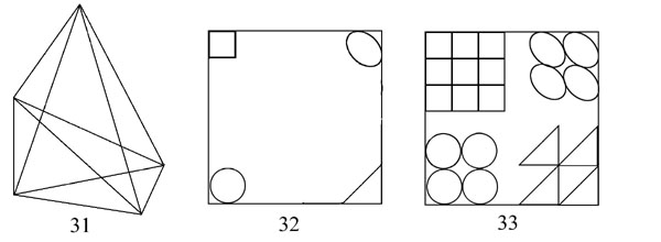
Returning to the concepts, we need to look into their details. We need especially to note the relations among them. It is plain that uniformity in some respects can vary independently with uniformity in others (shapes with colors or textures, for example), but equally that many uniformities depend necessarily on other uniformities. (equality of all the angles in a plane figure depends on equality of all the sides). A similar variability holds between uniformity and numerical variety of parts or its subspecies intricacy. The varying symmetries of regular plane figures depend on the number of sides (inter alia). Only careful examination of a given case can determine the connectedness or independence of its various uniformities, diversities, and numbers of parts or elements. Experiments are essential to procure the needed data.
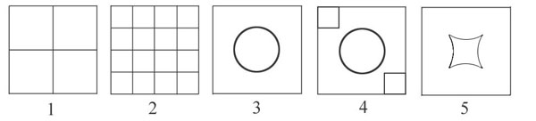
For instance, figures 1 and 2 are equal in uniformity and intricacy with respect
to the shape of delimited parts and but different in number of such parts.
3 has less uniformity and less simplicity of delimited parts than either 1
or 2. 4 is less uniform (more diverse) and less simple (more intricate) than
any of the others, but less various (in the generic numerical sense) than
2. 1 and 2 are also uniform in the orientation, alignment, and contiguity
of the parts. There is really nothing one can find that deserves the name
of diversity in either on the level of shapes. But the constituent shapes
in 2 have slightly more diversity of position than the shapes in 1. The parts
of 3 are uniformly centered in the whole, and the parts of 4 are severally
centered along the diagonal of the whole. 5 is intended to be an example of
enhanced diversity compared with 3, in virtue of the greater dissimilarity
of its two shapes compared with those of 3, but arguably its four-sidedness
offsets the discontinuity of its curving segments, even though the those segments
do not comprise a full circle and have a larger looser curvature than the
circle in 4. 4
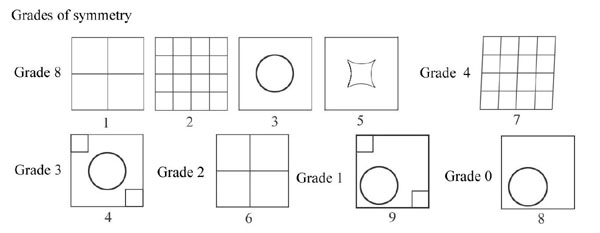
When we add considerations of symmetry the uniformity of designs is computed somewhat differently. Symmetries are distinguished by the kind of transformation that produces an identical design: rotation and reflection (mirroring or "flipping"). A design has as many symmetries as it has axes of rotation or reflection that preserve identity of shape. 1-3 and 5 have the highest grade possible for a four-sided format, namely four-fold rotation and four-fold reflection symmetry (horizontal, vertical, right and left diagonal flips). 4 stands lower, with two-fold rotational and double diagonal reflection symmetry. 5
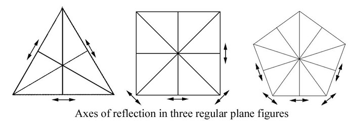
Symmetry is a kind of similarity of parts or elements. When Hutcheson applies his criterion of uniformity amid variety to plane figures and counts the square more uniform than the rhombus, he bases this on the uniformity of the angles in the square as opposed to the 2x2 diversity of those in the rhombus. This difference is exactly reflected in the different grades of symmetry possessed by the two sorts of figure.
Reflecting on this relationship can perhaps help explain Hutcheson's otherwise puzzling idea that the number of parts is a positive factor in beauty. On the face of it, this is exceedingly implausible - at least as a general rule, as Gerard for one observes. This appears to be confirmed by the fact that 2 is not more beautiful than 1. But Hutcheson is not thinking of the insipid variety of 2 compared with 1 but of the more interesting case of the regular plane figures, which he thinks increase in beauty as their elements become more numerous. There is a significant respect in which this sequence presents progressively greater uniformity and diversity, namely rotational and reflection symmetry. The equilateral triangle has three-fold, the square four-fold, the pentagon five-fold, and so on up the line without limit. This follows from the number of elements given the equality of lines and angles bounding the figures. The result is a steady increase in diversity of axes of rotation and reflection. 6
This in turn prompts another reflection, in view of the fact that diversity of axes of symmetry is a diversity of uniformities which furthermore leaves the uniformity of the whole unimpaired. For symmetrical transformations leave the figure precisely the same. This may lead one to wonder whether a greater number of elements never by itself enhances overall beauty, but always and only by producing additional uniformities and diversities which collectively leave undiminished the uniformity of the object as a whole. 7
4
The principle just proposed may perhaps be extended. Perhaps a diversity
will contribute to beauty only if it generates a new uniformity or strengthens
an old one. Vague as these notions may be, at least they suggest directions
in which to search for the magic formula - or more likely formulas for species
of beauty or beauty within particular parameters. (At most those two principles
give necessary conditions, not sufficient ones, for beauty.
Following up this line requires us to see whether just any diversity introduced
into a design without lessening the standing uniformities will improve the
beauty. Suppose we toned the circle in 3, and the two small squares besides
in 4, using a darker tone, obtaining 4.1 and 4.2. In each case we would seem
to add diversity without diminishing the uniformity.
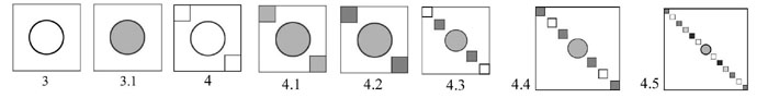
4.1 retains all the symmetry of 4, plus the number of parts; 4.2 does the same relative to 4. In 4.3-4.5 the number of parts is increased in order to further diversify the tones assigned to the squares without reducing the symmetry of 4. Note that retaining the same symmetry value requires that the diverse tones fall into a uniform (symmetrical) sequence. It seems highly dubious that the result is an ascending scale of beauty from 4 through 4.2, 4.3, and 4.4 to 4.5. But perhaps the case against the independent beauty-value of diversity is not quite so definitive as that against numerical variety. 8
5
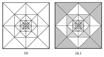
In examples 1-9 the uniformity is so great, diversity or complexity so slight 9 that few would find much to relish. The eye craves more to see, the mind more to construe, than the figures make manifest. Yet we should not entirely dismiss even so pedestrian a case as 1, since it contains an endless profusion of implicit order. The discussion of symmetry provides a path into this complexity. If we draw the axes of symmetry in its parts as well as in the whole we soon obtain a dazzling profusion of connections. Seeing the myriad complexities resident in figures like 1 should, I think, change our indifference into respect for the beauty of all regular and semi-regular figures. 10 is intended to convince you of this. 10 The uniformities implied by it at every level are prodigious. The diversity lies in their orientation and size, which are graduated uniformly. Modules are conspicuous everywhere. 11
Appreciating the complexity of a square will, I hope, give us more sympathy with Hutcheson when he expresses his relish for the regular plane figures. In the following diagrams I attempt to push this line much further than Hutcheson does by bringing out their hidden complexities, both those that involve abundant uniformities and those that introduce jarring diversities. They will also well serve us as designs upon which to work variations, in order to see what happens when uniformity or diversity is modified. To this end I subject three additional regular plane figures, the pentagon, hexagon and heptagon to the same sort of analysis as the square. (11-16)
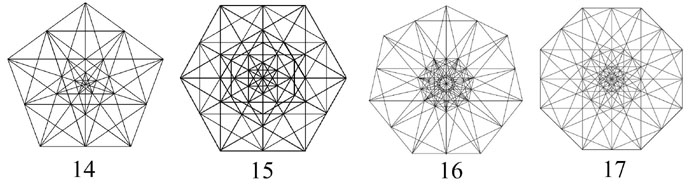
Confronted by the images I doubt that anyone will believe there is a clear order of merit in the series of progressively more "various" polygons, though the appeal of the different polygons is somewhat different. The hexagon is more fixed and placid, the pentagon and heptagon more mobile and active. But each has so many aspects of uniformity and diversity that it is difficult to be sure one has taken them all into view, let alone accorded them their due weight.
With a view to collecting more evidence let us look into the application of the third of Gerard's differentiae, intricacy/simplicity, which he says is a matter of number of dissimilar correspondent parts. 12 Are there more dissimilar parts in the heptagon than in the hexagon? Not shapes, since each has equally uniform shapes. There is an increase only in diversity of orientation without any reduction in regularity of the orientations. This produces an increase in the density of design in every part of the design at a given level of articulation. The effect is an increase of intricacy in the diagrams from 10 to 17. Our philosophers also take note of the different relation of opposite elements in figures with an even, as opposed to an odd, number of sides. The even-sided figures have opposed parallels, the odd-sided ones oppose a vertex to a side. The consensus is that the latter is a dissimilarity and an aesthetic deficit. But there are problems in accepting this. First, the feature is uniform throughout each odd-sided polygon. Second, it is necessary to obtain the next higher grade of symmetry. In these ways it adds to the uniformity side of the ledger. One needs a better reason than the increase in diversity of orientation for taking this modest increase in intricacy as an aesthetic deficit. On the contrary it is easily perceived as a merit.
Another way the dissimilarity can be increased is by toning the different parts, as is done in 10-13. But toning can be, as it is here, a prime example of diversity in one respect creating uniformity in another.
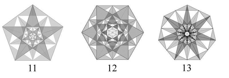
10-13 are more conspicuously ordered than are the spidery traceries of connections (connections inside of other connections without limit) in 14-17. The highlighted (darkened) lines and areas select sets with a clear relatedness to each other. But it is not at all apparent that such toning makes the more various figures (the heptagon, for example) more beautiful than the less various ones (pentagon or hexagon).
6
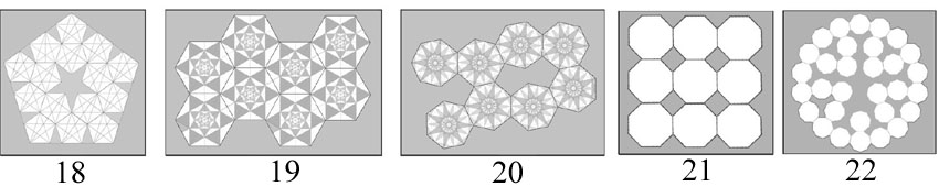
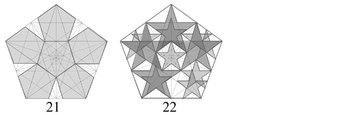
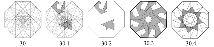
One consideration so far entirely ignored concerns not the implicit interior structures but what we might call their crystalline or cellular or modular potential. That is, some regular polygons permit dense packing with or without a smooth (rectilinear) outer border. Squares and equilateral triangles permit such packing with a smooth boundary. Hexagons produce a dense array within a border that is "crenellated" variously on different sides (19). Pentagons (18) and heptagons (20) cannot produce dense arrays. (Hence no crystal can have a five or seven-fold axis of symmetry. 13
The modularity-potential of regular polygons is relevant, I think, because
our visual appreciation of forms is strongly influenced by the applications
we can make of them in ordering our world. It is gratifying when a form can
be counted upon to fit with its kind to produce a dense configuration and
mildly frustrating when it cannot. Hence high modularity-potential is in itself
a merit. However, we must also take into account that polygons that are not
capable of dense modularity on a plane may be so as a face of a regular solid.
Pentagons so serve in dodecahedra. (So the plot thickens.)
7
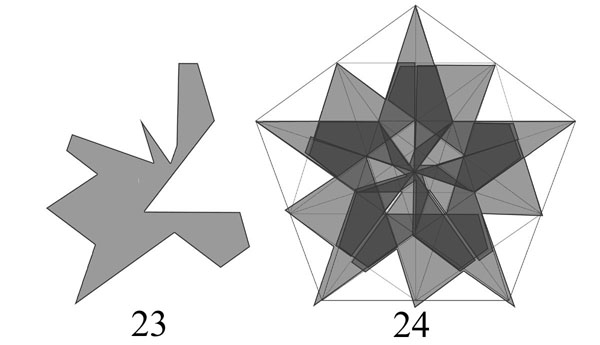
Treated impartially the interior web of the pentagon contains not just its like but also parallelograms, rhombuses, right-angled triangles, as well as highly irregular gerrymandered forms. If highlighted they seriously interfere with our aesthetic pleasure. For instance the ones in 24.1-4.
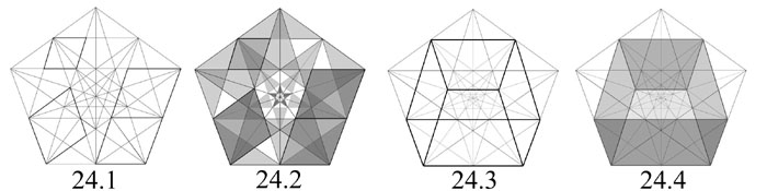
No one would judge any of these visually beautiful, and the reason would certainly be that they set up conflicts in our visual system. How different such images are in visual legibility than is 11, whose diversities set each other off rather than interfering. 11 satisfies to a high degree the psychological criterion proposed by our philosophers.
Another case of aesthetically dysfunctional uniformity amidst diversity is provided by 23-23.3.
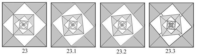
Their out-of-kilter character results from the non-alignments not falling into an ordered pattern. Thus the diversity produces no new form of uniformity. Were they to do so the deviations might balance out into a more complex, but still ordered, way, achieving the sort of well-ordered complexity that is aesthetically prized. When we encounter a design like 23 our first instinct is to search for such an order. Even though there is a progressive tightening of order from 23 to 23.3, the saliency of even the last, 20.3, is too weak to have much effect. Artists experiment with precisely this sort of weakly uniform diversity to discover what registers on the probing eye, or as the Eighteenth Century folks would say, on our sense of beauty.
8
The toned examples remind us of another resource available to our visual system for finding order in visual arrays. Unlike 1-9 the new designs come across not as figured surfaces but as layered.14 Layers gain in symmetry, though the totality does not. On this basis 8 has (perhaps we should say represents) weak symmetry due to both its layers being maximally symmetrical for their kind, even though there is no symmetry in the composite as such. How strong the effect will be depends on the strength of the depth cues. Lines graduated in weight can be potent. Transparency (full or partial) can be even moreso. Shifting to a layered or depth interpretation comes naturally when it results in a gain in uniformity.15 When the cues reinforce a coherent interpretation the effect is irresistible, as in 11-13. When cues conflict the result is confusion, equivocation, instability. On the other side eccentric interpretations that go against the cues never occur spontaneously in our vision. For example an interpretation of the unstressed network of connections in a pentagon (14) matching that of 24.4 can only be excogitated: we can only see that if the relevant lines were stressed the eye could see it spontaneously that way. 16
9
Various kinds of precise "geometrical" art works exist with different uniformities and diversities. For example, the nested squares familiar to us from Josef Albers' Homage to the Square (25). Such designs have only a modest degree of overall symmetry (horizontal flip) but the effect of rigorous order is ensured by the shared vertical axis and the diagonal alignment of their corners leading to a common center, as shown in 25.1. To discover how elaborate their order is requires an analysis of the sort we gave to the polygons. The result, shown in 25.2, is far from immediately lucid. But there are remarkably many coincidences. When we tone in the diagram, we get something like what might be produced by a super-rationalistic cubist (Juan Gris?).
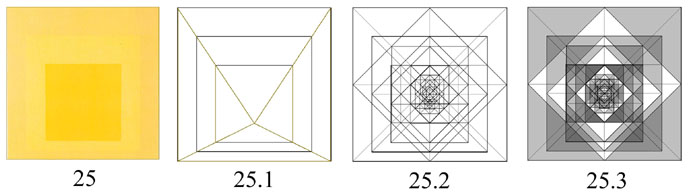
That response makes me think that we see such images in a fundamentally different way from the way that seems natural to all the preceding images. We don't merely demand to align it with our eyes conveniently for perceptual comprehension, as we do geometric or ornamental designs. Rather we address it in relation to gravity, which is to say topographically. The uniformity Albers achieves is proto-pictorial. This sets his images apart from all the preceding. Earth and sky come nowhere near them. To put it otherwise, regarded as geometrical or ornamental, the uniformity and variety of Albers' image would not satisfy, ingenious as it is.
The same shift away from the purely geometrical is much more obvious in the designs of Piet Mondrian (26), in which the asymmetry of the design is yet more complete.
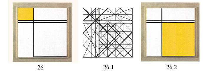
Here there is a studied avoidance of any symmetry in the design as a whole, as well of squares within the composition, or for that matter of rectangles of any "simple" ratio (including golden rectangles). Of course each rectangle has twofold rotational as well as horizontal and vertical reflection symmetry and the shape of Mondrian's format sans dessin often has the fullest symmetry available to four sided plane figures, since it is square. But the design's asymmetries collectively yield a cacophonous confusion of connections. 26.1 superimposes the divisions of 10 upon a similar web of connections derived directly from Mondrian's image. The result is farther than is the Albers from a complex geometrical or ornamental figure. Anyone who doubts this should be persuaded by 26.2, a design equally asymmetrical to 26 that is flagrantly distressingly to the eye however it is treated, ornamentally or in the proto-pictorial mode.
In fact we know both from the artist's statements and our own intuitions that his appeal lies in a quite different direction. In compensation for the geometrical disorder the painter offers a different kind of uniformity - one that demands asymmetry. The artist strove for a kind of restrained dynamism. This is a perceptual property consisting in a combination of optimum framing of the elements in the visual field of a being acting in a three-dimensional world and a sense of balanced physical energies. In my view this complex property is on a deep level pictorial, and it is an essential factor in virtually all nonfigurative high art as opposed to decorative design. This sets the works of Albers and Mondrian apart from all of the geometrical designs I have used to illustrate uniformity and variety in this paper.
How to handle pictorial uniformities and diversities is obviously beyond the scope of this paper. My purpose in mentioning these examples is mainly to distinguish them from the examples discussed previously. The result is that uniformity and variety vary importantly with the manner of visual receptivity we find natural to give to them. This variability does not necessarily defeat an appropriately framed uniformity theory. On the contrary. I think it supports a main thesis of the 18th century philosophers, to wit that the ultimate criterion of beauty is our sensory response rather than any set or ratio of response-independent qualities. The important underlying principle is that the response is directed by our cognitive system. It is this that gives the measure of universality to which the aesthetic can rightly claim.
References
Rudolf Arnheim 1966. Art and Visual Perception: a psychology of the creative eye. Berkeley, California: University of California Press.
Monroe Beardsley, 1958. Aesthetics: problems in the philosophy of criticism. New York: Harcourt, Brace and World.
Alexander Gerard, 1759. An Essay on Taste together with observations concerning the imitative nature of poetry. A facsimile reproduction of the third edition (1780) with an introduction by Walter J. Hipple, Jr. Gainsville Florida: Scholars Facsimiles and Reprints, 1963.
Walter John Hipple, Jr. 1957. The Beautiful, The Sublime, and The Picturesque in Eighteenth Century British Aesthetic Theory. Carbondale, Ill.: The Southern Illinois University Press.
Alan Holden and Phylis Morrison, 1892. Crystals and Crystal Growing. Introduction by Philip Morrison. Cambridge, Mass.: The MIT Press.
Henry Home, Lord Kames, 1763. Elements of Criticism, 6th Edition (1785). Edited and with an introduction by Peter Jones. Indianapolis, Ind.: Liberty Fund. 2005.
H. E. Huntley, 1982. The Divine Proportion: a study in mathematical beauty. New York: Dover Publications.
Francis Hutcheson ,1726. An Inquiry into the Original of Our Ideas of Beauty and Virtue in Two Treatises. Edited and with an introduction by Wolfgang Leidhold. Indianapolis: Liberty Fund, 2004.
Appendix 1: Proportion
I have so far ignored the concept of proportion, which is included in Kames' list of beauty-making qualities.17 This differs from other uniformities since every pair of elements or figures stands in some proportion to each other. What must be intended is something more specific. If we limit ourselves to uniformities available to the eye and to designs of the sort presently under discussion, proportion seems to me best construed as modularity, i.e., as elements standing in ratios expressible in fairly small integers, plus proportions that result from such modularity. This excludes Golden Section and other non-modular ratios taken in isolation, since they are only indirectly accessible to vision. But given a Golden Section figure as a module, the eye can recognize multiples or fractions of it.
On this basis the successively smaller gray squares in 10 and 10.1 are proportional to each other, since their sides successively diminish by half. The same is true of the white squares. Because of their symmetries in 10 the white squares also bear a constant (but nonmodular) relation to the next larger gray square. The proportion is thus constant.

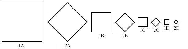
In length of sides 1A/1B=1B/1C=1C/1D = 2/1. Similarly 2A/2B=2B/2C=2C/2D=2/1.
In area the ratio is 4/1. Although there is no "modular" ratio holding
between 1 and 2, 1A/2A=2A/1B= 1B/2B=2B/1C=1C/2C=2C/1D=1D/2D. All of these
ratios are readily seen to be either modular or constant. It is not hard to
project these uniformities into the 1A in the fashion of 10, though the projection
is speculative. The eye cannot strongly confirm that 2A, for instance is just
the right dimensions to connect the centerpoints of 1A's sides unless the
orientation is the same as in 10:
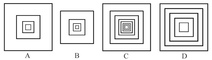
Clearly, the visibility of proportionality is strongly dependent on the manner
of presentation. A-D give the figures the same orientation and return to the
concentric placement of 10. The concentric squares of A are those of 1A-D;
those of B are 2A-D; C's are all of the above and D's are a series graduated
leaving equal steps. Which proportions are most convincingly regular to the
eye? Do A and B seem uniformly proportioned at all? Which most appealing?
Here are three more examples of concentric squares which are not regularly
proportioned. Do the eye and mind perceive an irregularity of proportion?
Do we feel any displeasure at the lack of proportion?

Kames makes two qualitative claims about proportions in buildings which have
some applicability to our cases. First, the sensitivity of the eye to small
differences is limited. Any proportionality within a range, e.g. columns between
8 and 10 times their diameters in height, is equally satisfying. Second, within
these limitations the eye experiences strong preferences.
"A room of which the parts are all finely adjusted to each other, strikes us with the beauty of proportion. It strikes us at the same time with a pleasure far superior: the length, the breadth, the height, the windows, raise each of them separately an emotion: these emotions are similar; and though faint when felt separately, they produce in conjunction the emotion of concord or harmony, which is extremely pleasant." (XXIV, 706) 18
The questions for a theory of aesthetic proportion to answer are (1) what sort of relation holds between objective uniformity and the sense of (good) proportionality; and (2) what the content of the latter is. Is it the satisfaction of seeming to discover modularity or some other specifiable sort of uniformity? Only painstaking empirical research can answer such questions.
Appendix 2: a sketch of a uniformity and diversity profile of the pentagon.
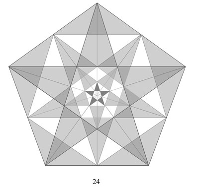
Uniformities
1. Uniformity of concentric pentagonal figures diminishing without limit in
each of the five orientations.
2. Uniformity of concentric golden section triangles diminishing without limit
in each of the five orientations.
3. Uniformity of pentagrams at all levels and in many, many places.
4. Uniformity of pentagons in locations other than the center, together with
the series of diminishing pentagons within them, plus the series of pentagrams
within each.
5. Uniformity of identical rhombuses symmetrically arrayed on either side
of the central inverted golden triangle, plus the series of diminishing rhombuses
within each.
Diversities
1. Diversities of size, orientation, and grades of symmetry.
2. Diversities of shape: pentagons, pentagrams, rhombuses, parallelograms,
triangles (golden, isosceles, equilateral, and other, and very many others).
An indication of the diversity and its orderliness can be gleaned from the
following, which serve as examples: counterparts can easily be constructed
for the other symmetrical figures within the pentagon (and so also for all
the other regular figures):
A remarkable feature (remarkable to non-geometers) is that there is no shape
within the web of connections, however eccentric, that fails to fit within
the web at each of the five axes of symmetry when rotated or flipped along
the appropriate axis. Here is an example. .
(Please ignore the imperfect registration.) The high grade of symmetry of
the regular figures shows itself in these regularities. The above composite
as a whole has no reflection symmetry (though its subordinate figures retain
as much as originally) but it retains the full measure of rotation symmetry.
Along the way it produces highly interesting new patterns, including the windmill
in the center. To my eye (and mind) the new figure has a delightfully virile
combination of uniformity and variety. The kaleidoscope works on just this
principle. The transformations are so neat I cannot forbear giving another
example, this one from an octagon.
Endnotes
1. The only other possible contrary is having no correspondent parts.
2. Lord Kames' considerably more complex terminology divides regularity
from uniformity and both from order, proportion, and number: Uniformity applies
to similar figures or parts within a single figure; regularity applies to
a part or a whole defined by a single rule - each side of a square, and the
square itself, are both regular. (738) Proportion requires inequality: the
sides of a square, being equal, are not proportional, [!] those of a "parallelogram"
(here he means a nonsquare rectangle) are, being unlike, are. (740) Order
applies to a number of particulars (parts or wholes) similarly oriented, e.g.,
the parallel sides of a square as opposed to the inclined ones of a triangle;
equally things placed in accordance with their natural connections, or presented
in accordance with our preference for grasping the whole before distinguishing
the parts. (26, 740) I agree that distinctions are needed, but prefer to make
them in terms of the sorts of uniformity, so far as possible. For Kames variety
= diversity, i.e. non-uniformity, since he contrasts it with number: "The
world we inhabit is replete with things no less remarkable for their variety
than for their number." (216) But in other comments about variety he
easily slips into speaking of multiplicity (of figures in a picture). Perhaps
there is no inconsistency here because it can be presumed that different figures
are also diverse.
3. See for instance Hutcheson's catalogue of uniformities found in
the planets (II,V): "Uniformity in the proportion of their Quantitys
of Matter, Distances, Times of revolving…, their Conjunctions and Oppositions…"
(31) Obviously each of these is a different uniformity.
4. The four segments of a circle from which the concave inner form
is made are less than quarters of the circumference of a considerably larger
circle. This constitutes an additional dissimilarity relative to 3.
5. The uneven vertical division in 6 limits it to horizontal reflection
symmetry (vertical flip). Though 7 retains full similarity of its parts their
symmetry is lessened relative to 2 because of the difference of angles, which
drops its symmetry rating four grades: like 4 it has two-fold rotational plus
double diagonal reflection symmetry. 8 has no symmetry of any kind, since
the circle is not bisected by any rotational or reflection axis of the whole.
Finally, 9 has the lowest positive grade of symmetry, that of single diagonal
reflection. (For the record 8 and 9 are also less uniform than their counterparts
in respect of similarity of parts, since in each the field is more dissimilar
to the other part(s) is the case in 3, 4, or 5.)
6. Kames is sharply critical of the Hutcheson's formula (Chapter XI).
It "is only applicable to a number of objects in a group or in succession"
and is further limited by the requirement that "the particular objects,
separately considered, be in [some] degree beautiful, for uniformity and variety
among ugly objects, affords no pleasure." (228) This last seems unfair,
since presumably ugly objects are those that are seriously deficient in uniformity
(or in the uniformities that count).
I admit this is speculative. Its uncertainty springs from the fact that we
have no ready way to sum up the total uniformities and diversities created
by changes. Weaker formulations are possible, such as one that allows for
a certain reduction in total uniformity: e.g., "…leaving the total
uniformity almost as great."
7. One may think 3.1 more interesting than 3 because the circle seems
more substantial, more like a disk than a circular ring. But if one reflects
that a white disk is just as well underwritten by 3 as a gray one is by 3.1,
this impression may altogether vanish and the two designs come out equally
interesting (or beautiful). True, the circular form in 3.1 is more salient
(more forcefully present) than its counterpart is in 3, satisfying the psychological
condition Gerard and Kames associate with uniformity. But 3 is more uniformly
toned (all areas within the lines being pure white). So which has the best
uniformity overall? This case calls attention to an important omission in
the standard accounts of uniformity and variety, namely their silence about
contrast as a beauty desideratum. Clearly the salience of a uniformity often
depends crucially on contrast. Overly subtle (faint) diversities may be as
hard for the eye and mind to appreciate as confusing ones.
8. 8 is more notable for simplicity than for uniformity.
9. In this respect I think the traditionally prized geometrical configurations
differ. The Golden Section cut and the figures that result, the golden triangle,
rectangle, cuboid and all the rest, are not accessible to the eye in their
Golden Section aspect. There are no visually given markers to help us plot
the golden cut. The sweeps of the compass required for constructing it are
not salient enough in anticipation. Hence the golden proportion is not used
in actual constructions by carpenters or masons. It is intellectually apprehended
via visually salient forms, the ratio found in sections of the diagonals of
the pentagon, for example. Without such aids we cannot point it out. We can
only guess that an architectural feature, for example a window, is proportioned
that way.
10My point here is not that the Golden Section is not mathematically beautiful
- beautifully potent, we might say - but only that this is not the kind of
beauty that Hutcheson and the others have (or should have) in view when they
talk of uniformity and variety in relation to plane or solid figures, based
as it is on their positing of a sense of beauty. Their examples confirm that
it is a visually accessible beauty with which they are concerned. Using the
procedures illustrated in 10 upon the regular polygons we find hidden structures
within them that make intelligible how a reasonable mind and eye can find
them (especially some of them) quite beautiful. Moreover their beauty can
be plausibly connected with uniformity and complexity of a fairly precise
sort.
11. For the sensitive eye the (weak) impressions of recession into
depth, much reinforced by the tones, add another uniformity amid diversity
(though the stages of recession are not regular ones if the successive squares
are taken to be the same "objective" size). Interestingly the white,
diagonal series of diminishing squares conflicts in this regard with the gray,
horizontal one.
12. It is easy to find counterexamples to Gerard's definition. "Intricacy"
derives from the Latin for entanglement, and this idea is deeply woven into
our common idea of it. Thus dissimilarity of separated parts (correspondent
ones, let us suppose) will not create what we find natural to call intricacy.
Any irregular figure (31) will satisfy Gerard's condition without seeming
in the least intricate, as will ones with dissimilar separated parts (32-33).
Thus interweaving seems a necessary condition of intricacy. The paradigm
cases are those that involve extensive interweavings, such as Celtic interlace.
Since the diagrams of the regular figures are also intricate, e.g., 14-17,
it is natural to suppose that is because they are read as layered; and my
introspection encourages me to think this is so.
If Gerard's definition is not sufficient for intricacy, is there an aesthetically
significant category for which it does suffice? There is, only if designs
with non-interwoven dissimilar correspondent elements form such a category.
One thinks of patchwork patterning as a possible species. Perhaps the following
two designs might qualify. The one is an enlargement of a part of the other.
It has many fewer dissimilar parts, so its more multiplex companion falls
within Gerard's category, but it is not plausibly less beautiful on that account.
Intricacy does not seem to require correspondent parts either. Jackson Pollock's
classic drip paintings are most certainly intricate without having anything
naturally described as correspondent parts. They richly deserve a close analysis
from this angle, especially to bring out what uniformity there is in their
conspicuous irregularity. They differ from entanglements that are intricately
disorderly.
13. See Holden and Morrison, 163. Interestingly, the pentagon admits
of a crenelated pentagonal configuration with a five-sided star in the center,
as in 18. But this cannot be expanded retaining comparable orderliness. The
heptagon, on the other hand can be expanded without limit with base-to-base
pentagons filling the gaps. Octagons also defy dense packing but are endlessly
extensible with squares as open spaces, a pattern which once was a popular
ceramic floor tile pattern (21). The porosity of the densest achievable arrangements
increases dramatically in nonagons (22).
14. Some of the untoned diagrams can also be read in depth, e.g. 3,
but toning clearly strengthens the effect of layers.
15. Rudolf Arnheim pointed this out long ago (1954). See Arnheim 1966,
97-8.
16. Even then our visual grasp of the pattern is unstable, since it
tends to reverse, convexity becoming concavity, as happens in 24.4 despite
the cues. Incidentally, one horizontal line in 24.3 and 24.4 is not present
in 14. A proper comparison of the toned to the untoned diagrams requires an
emended 14. But the point still stands.
17. Kames is frustratingly unhelpful about the concept of proportion
in figures of the kind under discussion. He refers us to the appendix of his
work for a definition but neither there or elsewhere gives any indication
of what proportions are beautiful in the case of purely geometric or decorative
figures or patterns, as opposed to what is beautifully suitable in relation
to a function, say that of parts of a human or animal body. He is most explicit
in regard to proportion in architecture, and we can glean quite a bit from
what he says there.
18. With architecture we have not just an intrinsically beautiful form
but a space within which to live, and many considerations become relevant
that do not apply to the forms we are presently examining. Still, Kames' general
points do apply to our vastly simpler cases.