Getting Deeper into Pictures via Digital Transformation: A Tale of Two Horizons
John H. Brown, 2003
Digital technology enables us to transform reproductions of originals in a wide variety of ways retaining the full color and texture of the source images. One use of this technique is to reveal the space in pictures more fully and comprehensibly than is possible by direct scrutiny, however exacting, or even by constructing diagrams. Another is to discover the advantages and disadvantages of the options open to the painter when engaged on the work, so as to set what the artist chose to do against that background of alternative possibilities. Transforms, as I shall call them, enable us to see directly what hitherto we have only been able dimly to imagine. Such direct visual access enables us to draw reasonable inferences about the artist's motivation and to appraise more realistically the artist's accomplishment.
Pictures incorporate a basic antithesis. They present a fictive three-dimensional pictorial space on a two-dimensional physical surface. A good grasp of a picture involves appreciation of both the fictive scene and the surface composition. When we tune into the relation between surface and depth in the great paintings of the past we often find unexpected complications-- really inconsistencies-- in the artist's construction of pictorial space. The usual description of linear perspective stresses its rationality and lifelikeness, as if artists always or at least normally obey textbook rules. But actual pictures tell a fascinatingly different story. The artist's actual task in depicting the desired content in the prescribed format turns out to be a complex juggling act. Different aims have to be reconciled by bending rules all over the place, achieving an illusion of reality against the odds. Actual pictorial spaces often work best by breaking the rules in just the right way. Finding the right way is an essential part of any pictorial artists' creativity.
The casual viewer is generally oblivious to the anomalies that result from this negotiation between antitheticals. But something registers at least preconsciously. This helps account for the sense of each artist having a unique style. Botticelli presents a "naturalistic" space in his Adoration of the Magi (National Gallery, Washington, D.C.), but it is identifiably his space, not Raphael's or Rubens' or David's. The same is true of less naturalistic styles, Giotto's, for instance, in his Arena Chapel frescoes. This individual character is a composite of many things, but of none more centrally than the projection scheme used to organize the things located in that space. Giotto's projection scheme is "naively" – unsystematically -- perspectival. Botticelli's is more integrated but contains conspicuous deviations from strict rectitude. Coming to terms with Giotto's and Botticelli's artistry requires one to unpack -- dissect, if you like -- the artful deceptions employed in coping with the complex problems the artists confronted when putting brush to surface.
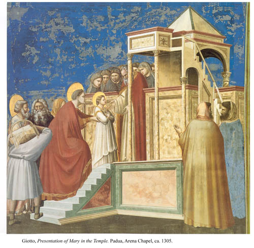
In Giotto's The Presentation of Mary in the Temple the various diagonals of the construction converge rather unsystematically to different horizons. The architecture, on which one counts for spatial markers, is a bizarre mixture of scales (the lower parts are scaled to the humans, the upper parts are presented in miniature) and inexplicable junctures (what supports the forward arch, where does the staircase leading down from the pulpit end?). These things call for explanation, but for shortness of time I will confine my attention to a local anomaly less likely to attract attention, namely the view of Anne as she hands Mary up the stairs to the temple porch. The stairs are viewed at an angle of about 45 degrees, and since Anne goes straight up them she should be presented from a three-quarter view, just a little less so than the porter just behind her. But as Figure 1 shows Anne is presented in profile,
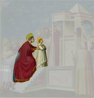
Figure 1.
such as would suit stairs presented from the side, as in Transform 1.
Transform 1. The stairs turned to conform with Anne's orientation.
It is easy to miss this anomaly. I know of no reference to it in the literature. Yet it can hardly help but contribute to the effect of the whole. How? Well, look back at the original keeping Transform 1 in mind. The profile helps to mark a plane parallel to the picture surface, connecting with the broad back of the nearest figure on the right, which does much to counterbalance the angled thrust of the building. And more: Giotto avoids giving a demeaning rear view of his protagonist and also completes a gentle sequence of angled stances running from the porter to Mary. All this, I submit, is easier to appreciate after seeing the transformed staircase.
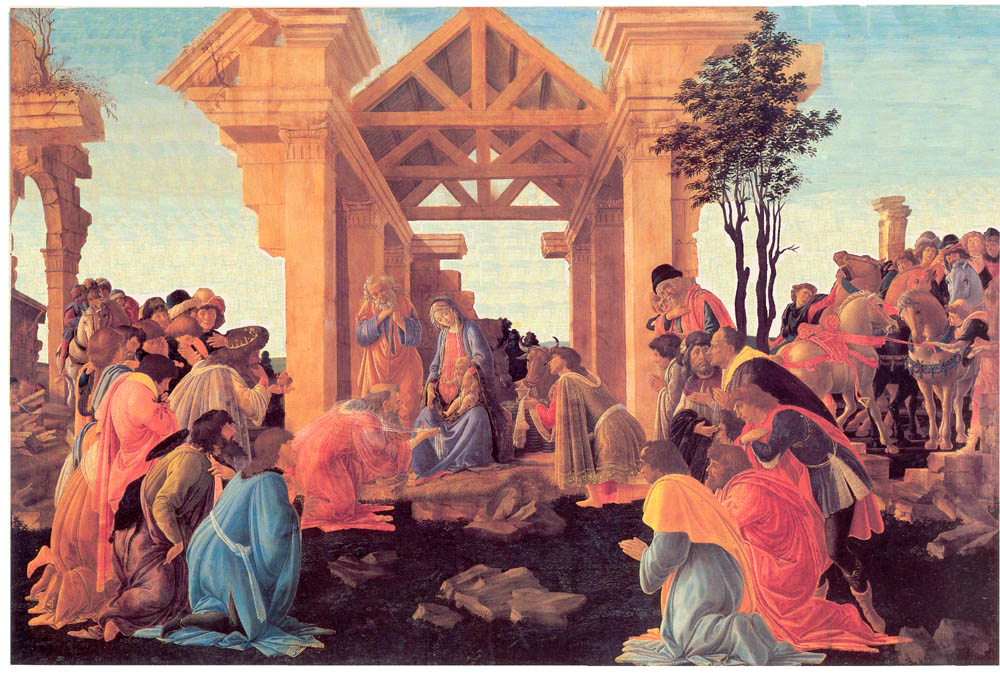
From the Giotto I turn to Botticelli's 1481 Adoration of the Magi (National Gallery of Art, Washington D.C.) in which the temple roof appears oddly uptilted. What exactly is going on? Is the temple perspective out, and if so how? Is the spatial tension in the scene a misfortune or a stroke of genius?
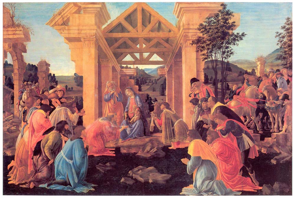
Botticelli, Adoration of the Magi, 1481, 28"x 41". National Gallery of Art, Washington, D.C. Click on image for enlargement.
Few if any can take the measure of this space simply by eyeballing the picture.
Ordinary mortals gifted with knowledge of perspective can develop, sharpen and
confirm their direct visual impressions by using a conventional perspectival
diagram, as in FIGURE 2, which makes it clear that the temple converges
to a much lower horizon than fits the landscape. Thus it ceases to surprise
that the structure appears to burrow into the ground rather than standing on
the level.
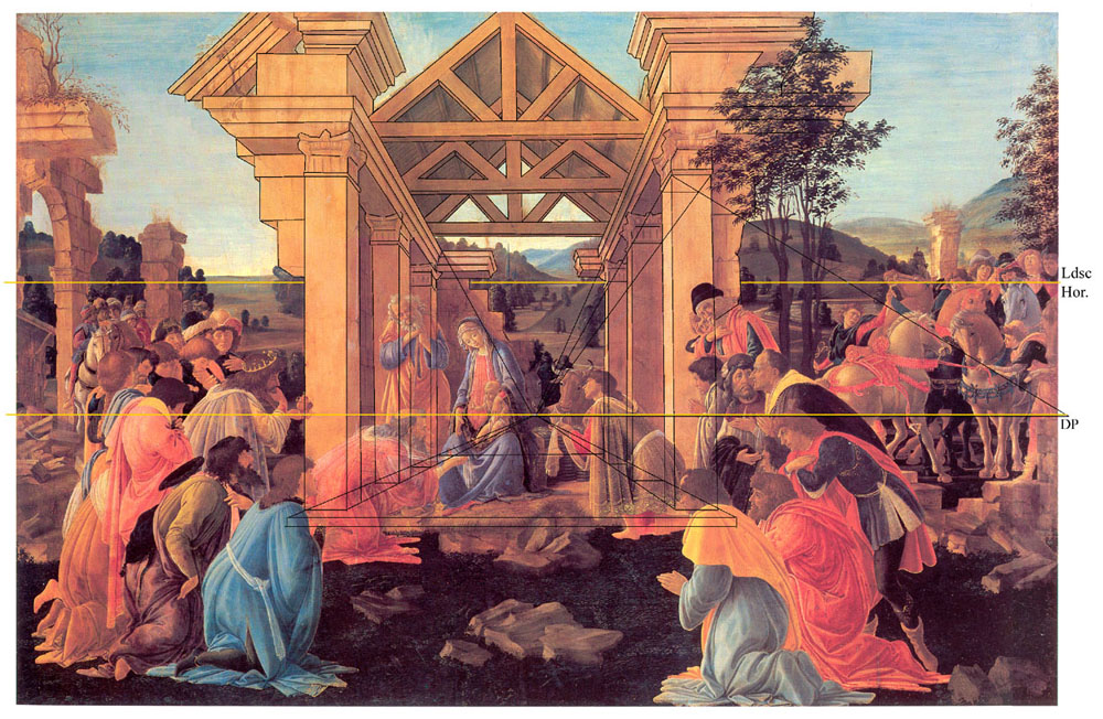
Figure 2. Botticelli's Adoration with perspective diagram overlaid. Temple horizon lower than landscape horizon.
Having reached this determination, we want to know why Botticelli combined such discrepant elements, creating in a way two different pictures. This is an aesthetic problem: what is the artistic good of such a combination? Like all aesthetic problems this one involves a comparison with alternatives. Foremost among the relevant alternatives are the spatially consistent constructions that preserve as much of the original as possible. But how are we to gain access to these? Here digital technology comes to our aid. We construct Photoshop transforms of the original that represent correct solutions to the basic projection problem. Being able to compare these with Botticelli's original puts us in a far better position to explain and evaluate the artist's choice of the Adoration's somewhat scrambled projection over the spatially consistent alternatives, since the whole set of options stands immediately before our eyes, the ultimate arbiters of artistic worth. Armed with the data of direct vision keen, well backgrounded students of 15th century Italian painting can gauge the virtues and shortcomings of each, thereby to determine the artistic value properly assigned to Botticelli's hybrid invention and form plausible hypotheses as to why the artist opted for this over the perspectivally consistent solutions. By taking full advantage of the images one can come closer to seeing through the eyes of the artist than is possible by any other means.
The first solution lowers the landscape horizon to the level of the horizon implied by the temple. (Transform 2) The result is to place the temple on a rise of ground with the landscape reduced to a few patches.Were we to judge by our own priorities, the image should receive high praise, for it gives the figures greater saliency and the space more integrity. But loss of the typically (and delightfully) Botticellian landscape would not have been acceptable to the Florentine public, perhaps because the regional scenery was a source of pride. (See endnotes 1 and 2) So regularizing the perspective in this way may not have been a practical option in the culture of the day, whatever intrinsic virtues it may have.
Transform 2: Landscape horizon lowered to conform to temple horizon. Temple perspectivally normal when viewed from close enough (not possible for normally sighted persons on this web site).
The pictorial space in this transform is comparatively unified. To appreciate
it visually one needs to see it from the right distance, which is about ½
x the width of the picture. This is too close to the page or monitor screen
for any but the near-sighted to focus clearly. But if one views the original,
which is 41 inches wide, from the correct viewing distance of about 20 inches
at the elevation of the temple's horizon with one eye only (monocular vision
is perspectivally optimal), the scene snaps into a far more robust illusion
of reality than is otherwise obtainable. Viewed from farther off in the normal
‘walkabout' manner it will still look distorted to a discriminating eye.
That however is part of the pathos of pictorial representation, a direct consequence
of the basic antithesis of surface and depth. Given that no picture can look
precisely right except from the right point of view and that viewers have an
inveterate disinclination to be restricted to a single station, non-optimal
viewing and proportionately diminished verisimilitude are a normal part of the
order of things.
The other options regularizing the perspective of temple and landscape involve raising the temple horizon to the level of the landscape horizon. Here two possibilities present themselves. The first (Transform 3) is to raise the angle of the floor, lower the angle of the roof, and narrow the view of the side walls to fit the more distant point of view entailed by the first two changes. The second (Transform 4) is to raise the angle of the floor and extend the verticals of the temple to the point where the original roof converges to the higher of the two horizons.
Transform 3: Perspective unified using the landscape horizon and the leveled roof option.
Compare Transform 3 with the original. The area taken up by the roof has been diminished. It no longer presents an enclosure – a baldacchino – as commensurate in bulk and form to that of the figural group or for that matter so well proportioned to the massive pediments and capitals as the original does. In this way the holy family and magi are not so well served by the leveled roof. Perhaps a lesser artist than Botticelli might accept that option, but he is too bold a designer to settle for such a solution. Perhaps I am presuming a lot here. Ultimately the matter should be decided by the best Botticelli connoisseurs. But I think that even lightly backgrounded viewers with a good sense of design will see the problem with Transform 3 compared with the original.
Transform 4: Perspective unified by using the landscape horizon
and the high temple option.
Transform 4 slides the roof, angled as in the original, upward to a much higher elevation, so that its receding edges converge to the higher, landscape horizon. At the same time the transform tilts up the floor. There is no need to narrow the view of the side walls, since the distance of viewing remains the same as in the origiinal. What results? The holy family and magi are somewhat diminished and exposed. By the same token the structure, which is already grander than is quite consistent with the biblical account, is further magnified. Also, from a purely compositional point of view a somewhat awkward emptiness is left between the broadly spread scene on earth and the high-flown superstructure. Vertical and horizontal now seem in conflict with each other.
If we judge on the basis of the foregoing observations, our conclusion will be that Botticelli's construction, inconsistent as it is, is preferable, all things considered, to the alternatives represented by the transforms. But note that the preferability is predicated on different criteria. On purely aesthetic grounds Transform 2 is preferable, since the landscape benefit is purchased by the original at the cost of more intrinsic pictorial values – more intrinsic in that the artists and cognoscenti of even Botticelli's day would have almost certainly been yet more impressed by the transform than by the original. (Here as always I speak under correction by the best Botticelli experts.) The other solutions come up short compared with the original on intrinsic pictorial grounds.
Without the direct visual experience of the transforms, I do not believe such judgments could be made with anything like the same confidence – or put on such a sound footing.
One more spatial anomaly almost shouts from the picture: single figures carry with them their own horizon. Consider in particular the foremost kneeling man. He is depicted not from above, as required by either of the two main horizons, but from a level well below his waist. This inconsistency becomes evident when one uses Photoshop to extract him from the context, as in Transform 5. Returning to the original with Transform 5 in mind the effect is mildly disturbing: the figure, like the temple, seems angled away from the vertical or floating in its own space.
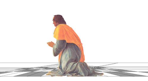
Transform 5: The foreground figure extracted and given the horizon implied by the figure alone.
The explanation of what is good about this is too long a story to present in detail in the time allowed. For present purposes let me simply cite section headings: such presentations favor ‘disjunctive' viewing of each figural level separately, are canonical for perceptual cognition of each item separately, avoid favoritism among the depicted personages, and harmonize felicitously with the two-dimensional surface properties of the design. Also the alternative, which features views minutely adjusted to each different level, is so much more difficult to achieve that it was excusably felt not worth the effort, all things considered.
Unhappily the last point applies with a vengeance to the project of making the digital transforms needed for a definitive test of the explanation that would result from developing the section headings into a proper argument.. For making those transforms requires reshaping each off-level figure and bringing into view the parts hidden in the original. Hence we have only our imagination to help us rectify the angles of the figures and take stock of the resulting artistic effect. For the present, then, this part of my argument must remain more conjectural, less well warranted, than the other parts.
Much more could be said about the pictorial space in Botticelli's Adoration, for instance about the ambiguities of depth (can all those figures fit into the available space?). But I hope that the things I have pointed out will encourage others to probe traditional works for the secrets they contain using the technology that best brings them to light. The ultimate aim, let me say as clearly as I can, is to appreciate more fully the artistry in pictures by responding more sensitively to the visual challenges they throw our way. Pictures are great when they do more than imitate a moment of perception, when they set our visual systems in a state of vibrant play of a sort unattainable in perception of actual scenes. The discoveries revealed by the sort of analysis presented here get fed back into our visual data-base and enrich our experience when we return to the originals for sheer enjoyment.
The revelations attained with the help of digital transforms apply to many sorts of pictures and nonpictorial visual designs. In other studies soon to be posted on this website I discuss examples from Giotto, El Greco, Cézanne and Mondrian. As the technology improves its scope will widen and its application will become progressively easier – at present it often requires prodigious effort. How universal its capability will become is impossible to determine. But clearly even in its present state it has vast potential to enlighten us and train our faculties, and on that account deserves to be vigorously cultivated by art historians, art educators, and aestheticians.
Endnotes
1. My explanation is admittedly speculative. Also my description of it as delightfully Botticellian may elicit wry looks from Botticelli specialists, since more than one disparages his landscapes as dull, following Michelangelo. Perhaps one should simply say that a landscape behind the main motif was expected, and that Botticelli complies with that expectation. The art historical question is then why the high landscape desideratum exercised so much force when much could be gained by giving it up. After all, artists were certainly familiar with occluded landscapes in the course of their everyday experience, and must have at times have appreciated the special salience motifs can gain from being set against the sky. Was Botticelli's choice in the present case justifiable within his artistic context by some specific artistic good (e.g. in suggesting the momentousness of the holy event to the world as a whole), or was it just a default option, a residue from centuries of medieval art? Or to approach it from a different angle, did the temple's appearance of slanting into the ground, which is a necessary by-product of the high landscape, minister positively to the Quattrocento viewer's impression of the whole? If we are interested in Botticelli's artistic achievement , such questions are vital.
2. To date I have not discovered any detailed treatment of Botticelli's space in the literature. But as a philosopher of art rather than a specialist in art history I can only proceed subject to correction by my betters. All that I can be certain of is the relative paucity of detailed treatments of his space in the standard works published in the last fifty years. Notice that I am concerned here with the pictorial space, not with the various "formal" properties of the surface design, which are much more adequately treated. Almost all of the attention devoted to the pictorial space in Renaissance paintings is directed to the gradual attainment of rational perspective, as in Panofsky's Perspective as Symbolic Form and in White's The Birth and Rebirth of Pictorial Space.