Mondrian's Balance
Abstract
The classic works of Piet Mondrian are widely celebrated for their dynamic equilibrium. The art-historical literature on Mondrian has accepted Mondrian's frequently avowed aspiration to achieve a vital equilibrium holding between all contrasts within his rather spare Neo-Plastic parameters. More than any other oeuvre of comparable size his seems an ideal field within which to test human capacities to distinguish subtle differences and degrees of balance/ imbalance. Further, the simplicity of his facture makes his works ideal subjects of experimentation by way of ordered variations, which can now be produced at will by digital transformation. The first results of selective variations tend to cast doubt on the fineness of equilibrium in the works and in the human capacity to respond differentially to changes in structure, challenging the received wisdom about Mondrian and more generally about aesthetic properties. But minute consideration of more systematically graduated sets of variations offers hope that in many cases surprisingly fine discriminations of equilibrium can be made in at least some of the dimensions basic to Mondrian's art. The main outcome of the investigation using digitized images is to set an agenda for more patient and systematic study of aesthetic properties than has hitherto been feasible – or been thought needful.
[The footnotes are placed immediately following the main body of the paper and may be accessed by clicking on the number. Click previous page to return to text.]
*************************************************************************************************
I. Mondrian's project
It is a commonplace about the classic phase of Mondrian's oeuvre that the artist achieves a subtle asymmetrical balance in his compositions. Much of our pleasure in engaging with these works seems to be appreciation of their balance, a balance which provokes our interest and awakens our admiration because it is so challenging. It strikes us not just as asymmetrical, which is not in itself remarkable, but as surprising, eccentric, improbable, even mysterious. The compositions are typically experienced as strong or stable yet also as dynamic, as containing the "equilibrated contrasts" 1 at which the artist aimed. In designs so purified of representational (pictorial) significance, so resolutely flat, so deprived even of the optical space found in Pollock or de Kooning, so limited in form, color and texture, what indeed would there be to admire were it not for some extraordinary virtue of balance? The artistic challenge in such a program comes in discovering in the compositions subtlety and depth commensurate with their presumed eminence.2
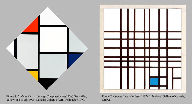
Further, for all their constrictive geometrical parameters – strict rectilinearity and perpendicularity – the works are full of deviations from geometrical regularity that suggest refinements of balance. The "planes" may be strictly rectangular and strictly oriented in the vertical and horizontal, but they almost always deviate from any simple proportionality. With rare exceptions what may appear squares are not in fact equal-sided. A given shape is almost never exactly repeated in a work and the large rectangles are almost never exact multiples of the smaller ones. Diagonals of the rectangles almost never carry on to the corners of other rectangles or to the corners of the support. Nothing ever stands precisely centered in the center.3 Further, the planes may be enclosed on all sides by the black lines or only on two or three, the free edges being bounded only by the edge of the canvas. Particularly when the canvas edge is raised above the frame, such a plane seems less confined, its comparative freedom seeming still stronger when the canvas is a diamond-shaped "lozenge," the edges of which necessarily cut the planes at a 45 degree angle. (Figure 1).

As for the lines, they may be perfectly straight, but they come in different widths, sometimes multiples of their neighbors, sometimes not. Sometimes they have the aspect of bordering the colored or colorless rectangular "planes" and beginning in the mid-30's sometimes run freely across a plane or the whole surface edge-to-edge as independent elements with enhanced importance. 4 (Figure 2)
The deviations from geometrical
simplicity/regularity and the complications of effect are evidently carefully
contrived. To this extent there is a studied avoidance of regularity or simplicity
in favor of a play of small differences upon which the artist counts to deliver
his compositions from decorative banality. And these deviations and complications
cumulatively suggest just the sort of fine adjustments required to achieve a
subtle, eccentric balance of substructures within the whole at a level of sophistication
that makes the works worthy of the viewer's intense and sustained concentration.5 Regarding fine adjustments, recent studies
show that the artist made numerous alterations in works which remained in his
studio for a significant time. See Cooper and Spronk for many intriguing examples
of alterations great and small, many made after the initial public exhibition.
There is an initial, one might say axiomatic, positing of balance in the strict
verticality and horizontality of all lines and planes. Unquestionably this contributes
a certain fixity of relation between the composition and the viewer, to whom
an upright orientation is a fundamental cognition-enabling condition.
6 On the other hand, the egregious eccentricity of the spacing of lines
and planes, taken together with the studied absence of any dominant form, creates
an equally axiomatic counter-posit of prima facie imbalance. The latter poses
a challenge to visual comprehension because it deprives the viewer of any explicit
ocular focus or any explanation of why such a focus should be lacking. 7 It raises a question: how the viewer should center her gaze? The format suggests
the center, of course. But weakly, and puzzlingly, for the pattern makes one
wonder whether one of the strongly salient planes is not the proper focus in
spite of its eccentricity. This "visual problematic" entails that
special steps, in the form of compensatory adjustments consistent with Mondrian's
spartan parameters, must be taken to achieve a final balance. Further, given
the resolutely nonfigurative character of the composition, the achieved balance
is bound to be somewhat strange, disconnected as it is from familiar modes of
balance found in pictorial art. In sum, it will be a balance that exceeds or
defies expectations and creates new problems for aesthetic theory to explain.
II. Balance
What is meant by balance or equilibrium in Mondrian's paintings? In what follows I attempt a sketchy analysis which is not meant to be more than a rough draft. Anyone who has surveyed the literature and confronted Mondrian's works is bound to be impressed by how uncertain is the meaning of these terms. In such a situation it seems best to be inclusive rather than selective when counting something as an aspect of balance. I follow that policy.
In the first place it is clear that visual balance is not an intrinsic property but a property of response. This is of course consistent with (in fact implies) that there are base properties intrinsic to the design that elicit the response. Moreover, there need be no single overarching base property for the singularity of the term. Perhaps there is a singularity of response underlying our use of "visual balance" but even that is doubtful and in any case not necessary.
As such, visual balance is the capacity of a design to elicit perceptual experience in which the viewer is satisfied with the distribution of forms, colors and textures in the design. One requirement is that dissatisfaction be avoided, and the concept can be somewhat more narrowly specified by listing the kinds of distribution dissatisfaction with which constitutes imbalance. For example:
1) imbalance of placement
or relative size of forms, favoring the left over right, the upper over lower
registers, one quadrant over another;
2) imbalance of weight of colors or textures;
3) imbalance of vertical/horizontal linear elements;
4) imbalance of closed/open planes;
5) imbalance of visual interest
Imbalance always entails that a shift of direction, or of color or tone, or of placement or size, or of visual interest will achieve balance, i.e. satisfaction with respect to the distribution of the sort of elements in question. It will not guarantee satisfaction with respect to other properties, such as the sensuous richness of color.
Can the satisfaction be further specified? Perhaps it can. At least in part it seems to be a satisfaction taken in the cognitive accessibility of the design: designs that are balanced generally come across as easier to comprehend than ones that are ill-balanced. Symmetry is an obvious cognition-enabling feature, but any comparability across difference favors cognition. Thus when the vertical oblongs in a Mondrian seem comparable to the horizontal ones, we have the impression of having more specific knowledge of them than we do when we merely see that one is somewhat greater than the other.
Another aspect of the impression
of cognitive accessibility is this: when a design is balanced we seem to be
able to see all we need to see by a centered gaze. We do not hanker after shifting
the design so as to see more or less of any plane. After exploring the design
our eyes can best take in the whole with the format centered, rather than being
restlessly drawn to one of the planes. This condition is fulfilled by Figure
3 but not by transform Figure 3Y where the largest rather than the
smallest plane (leaving aside the narrow planes between the double line) is
yellow. Our eyes are obsessively drawn diagonally south-east toward the center
of that yellow plane, whereas in Figure 3 one's gaze seems comfortably to take
in the whole from what seems a centered position. (I say seems because there
is as yet no measurement of the actual position of viewers' eyes relative to
that composition.) 8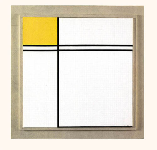
Figure 3 (repeated). Click on image for Figure 3Y.
However, I do not believe that cognitive accessibility is all there is to our experience of balance. When a design seems top-heavy other things are also at play, for example quasi-representational factors of perceived mechanical pressure, such as the impression of oppressive weight, i.e. weight inadequately supported or uncomfortable to experience empathically.
III. Dynamic balance and strength of balance
For Mondrian it is not just any sort of balance that matters, but asymmetric balance. This has clear literal meaning, in that symmetry of form is excluded: right-left and vertical symmetry are certainly out. Beyond this the type of equilibrium the artist cherishes he calls dynamic. What can be meant by this? One thing clearly emerges from his writings: not just tranquility but harmony (at least of the normal sort) is to be avoided. Rather strength is sought – we are to achieve equilibrium of maximum strength. Some species of forcefulness is indicated. How can this metaphor be cashed? The following are plausible strength-determinants:
1) the tautness of the
lines
2) the incisiveness of the rectilinearity and rectangularity
These two are common to all Mondrian's classic works with the possible exception
of the very late ones where the tautness of the lines seems somewhat compromised
by segmentation.
3) the sharpness of oppositions among balanced elements (density/attenuation,
color/non-color, verticality/horizontality.
4) the distance between such balancing features as stand at a distance, so that
no part of the surface of the painting is mere background.
These determinants accord with the overarching idea of the viewer's visual-imaginative system being engaged in an animated, complex interaction with the design. The dynamism of the design derives from traverses and linkages across space and shifts from literal to quasi-representational or metaphorical registers. The balancing of these within the design is strong when the visual system is exercised more strongly than usual by the extremity of the traversals, linkages and shifts. Where there is symmetry, for instance, the visual-imaginative system is less actively exercised in estimating the balance than in the case of asymmetrical designs. Even within asymmetrical designs the balance may be more or less difficult to assess. On this account much of the strength of balance is a reflection of the effort required to apprehend the balance. The rest is the tautness-swiftness of the lines, the incisiveness of the angles, and the uniformity of color and texture, which offers no resistance to the passage of the eye. We might call the last starkness.
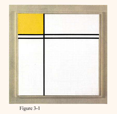
Examples of balanced "unlikes" abound. In Figure 3 the small yellow plane in the upper left balances the large white plane in the lower right, but only because the latter is bordered by a black line on the bottom. Remove that bounding line, which connects with the vertical like the base of a bookend, as in Figure 3-1, and the double horizontal seems somewhat precariously cantilevered. The bounding line also gives a base for the whole composition. But notably when extended leftward across the whole, as in Figure 3-2, the full-width horizontal creates a compound rectangle which is unacceptably broad – unacceptable because the verticality in the composition is overshadowed. Click on the image for Figure 3-2. Click 'Back' to return.
It seems likely that strength
is distinguishable not just from exactness of balance but also from (the impression
of) resistance to upset or destabilization. For some designs are delicate, others
sturdy. Both may be well or ill-balanced, and with equal strength in the foregoing
sense. But the sturdy balance will present the appearance of being more resistant
to upset merely because heavier, because it has thicker lines and a more compact
form, with a lower center of gravity. It remains to be seen whether its balance
is more resistant to disturbance in a different way, namely by requiring shifts
greater than those needed to disturb the balance of a delicate composition.
IV. Preliminary survey of examples
What do we find when we
examine, and seek to grasp and understand, the balance achieved in particular
works? Given the large Mondrian literature one would expect there to be ample
commentary on the niceties of balance/imbalance in specific cases. But in fact
there is a remarkable paucity. 9 This would not
be discreditable if viewers could be expected to see for themselves whatever
needs to be seen in the way of balance. But examination of Mondrian's oeuvre
brings to light challenging problems relating to appreciation of balance. Here
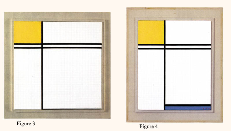
are two sorts. (a) Cases in which two otherwise quite similar compositions differ
in a conspicuous, apparently balance-relevant respect. One would suppose that
if the first composition is in balance, the other is not likely to be. Yet both
works are presented by the artist as if in good balance and commentators almost
never question the achievement of equilibrium in both. 10 For example the following pairs:
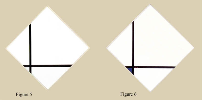
(b) Cases in which a given composition, in itself conspicuously eccentric,
seems no less balanced when reversed right to left. Strong asymmetries in general
do not retain their aesthetic balance when reversed, so it is mysterious why
these do (or seem to do). 11 Mondrian never acknowledges
the equivalency (if equivalency it is) of work and mirror image and no commentator
I have encountered does so either. We have the curious question whether the
mirror image "Mondrian" is as faithful to the artist's project as
the work the artist devised. Examples are:
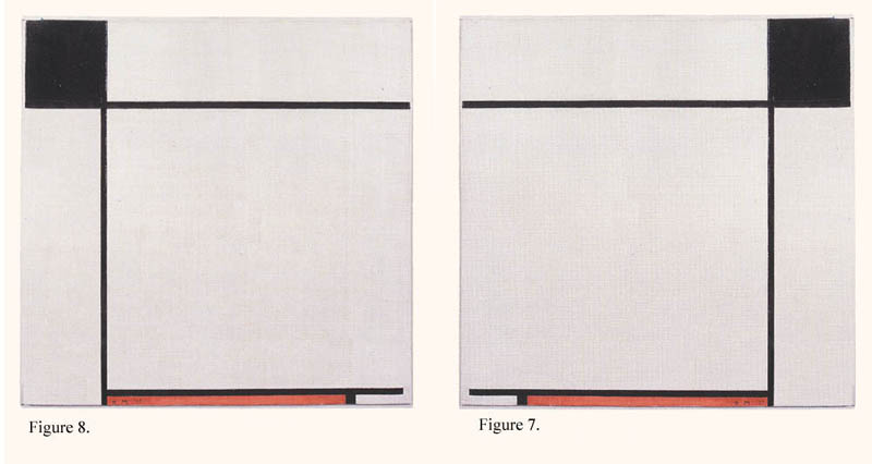
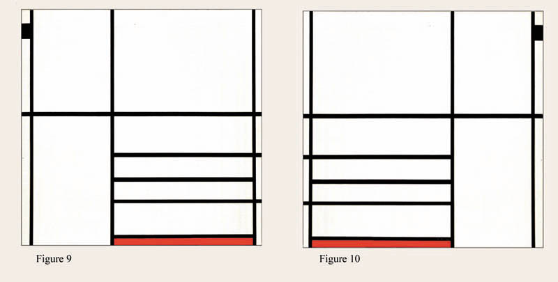
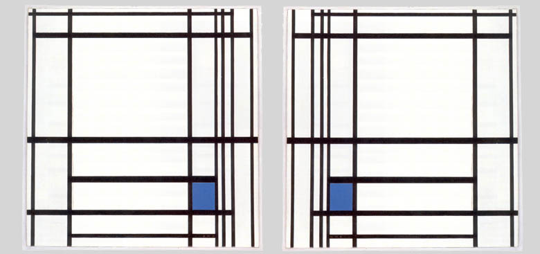
Figure 11 (left) and Figure 12 (right).
To the first class can be added innumerable examples by strictly controlled digital transforms of Mondrian compositions.
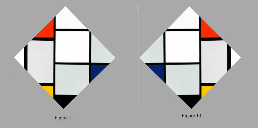
Not surprisingly it is also possible to disturb the equilibrium of Mondrian's compositions by various means. To my eye, many compositions are thrown out of balance by left-right reversal, as in Figure 1 compared with its mirror-image, Figure 13.
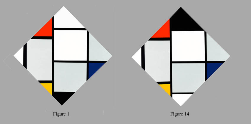
Almost all are by top-bottom reversal of key elements. (Figure 14 compared with Figure 1)
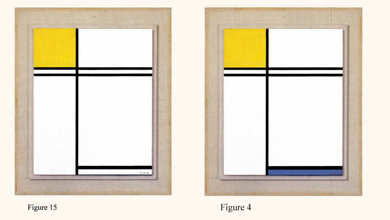
And many other internal shifts within the bounds of Mondrian's parameters will do the trick. The problem is not that a single alteration is never potent. It is that so many of them are apparently ineffectual. At even the most intense first sight they don't seem to make any difference so far as balance is concerned. Consider Figure 15 compared with Figure 4,
 or Figure 16 compared
with 3.

These findings, unless refuted by more accurate aesthetic perception 12, constitute a major problem for those who wish to say that Mondrian's excellence lies in substantial degree in the fineness of the equilibrium found in his compositions. For no equilibrium can be fine (exact, precise, delicate) that is insensitive to the variables exploited in the examples.
The findings are also a problem for those who wish to say that the aesthetic integrity of a composition depends on each element having precisely the position it does. They cast serious doubt on the rhetoric of formalist aesthetics at even a lesser level of presumption. For they suggest that our sense of balance is not nearly so sensitive as traditional formalists were persuaded it is. The mantra "every difference makes a difference" taken in the sense: each plausibly balance-relevant difference makes a difference to the balance, is seriously challenged by the large variations that don't appear to make a difference. One wonders if our balance-sensors are as thinly distributed as the touch-sensitive nerves on our backs. 13
Such findings also suggest that we can put the formalist sector of aesthetic response on a firm footing only by much more extensive and rigorous experimentation with transforms of existing designs. We seem not at all safe if we count on our inability to imagine changes of structure without a change of balance. Our imagination seems too servile to be relied on, particularly with regard to art works which are, after all, devised by a balance-sensitive person to challenge our powers. 14
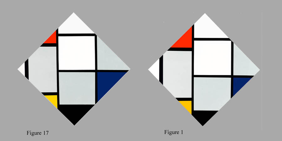
Finally, they suggest that when we think that we are registering an achieved delicate (horizontal or vertical) balance we are often responding not to an actual delicate balance (of that sort) but to other aesthetic properties. Thus when we prefer Figure 1 to Figure 17 it may be the greater similarity of the quadrilaterals occupying three corners of Figure 1 to which we are responding, as much as we are to its (horizontal/vertical) balance.
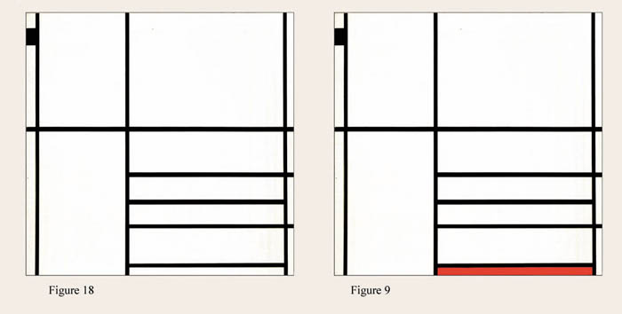
Or perhaps it is the delightful shock of the red in Figure 9 that persuades us that it is H/V-balanced whereas Figure 18, a transform that deletes the color is not, rather than the latter's deficiency of H/V- balance.
Robust development of a formalist component of aesthetics will require a method of distinguishing distinct aesthetic properties of the formalist sort, of seeing more distinctly the intertwined objects of our response. 15
IV. Varieties of equilibrium: more mysteries
So far I have dealt exclusively with balance along the vertical and horizontal coordinates. Mondrian explicitly aims at equilibrium across all compositional "contrasts:" "only by approaching real equivalence of all the oppositions in the work can we approach exact equilibrium and achieve it with maximum strength." NANL 253. Oppositions specifically cited by Mondrian are vertical vs. horizontal lines ("straight lines in rectangular opposition," 253) and planes ("If either horizontal lines or vertical planes dominate the expression, the tragic regains ascendancy (N-PAF 197); and color vs. noncolor ("Neo-Plastic colors – which are pure, planar, determined, primary and basic (red, yellow, blue) – are in opposition with "noncolors" (white, black, gray)" N-PAF 197). Commentators have suggested others: lines as bounding planes vs. free-running lines; structural features vs. optical effects, e.g. the flickering of white spots at the intersections of lines (Bois, 358) and contrast effects in small white planes; and planes as planes vs. planes as white lines (when narrow in relation to their width, as in Figures 2, 3, 4); and so forth. Since Mondrian repeatedly insists that equilibrium of all elements is sought, one cannot deny the relevance of any claim about the equilibrium of paired formal elements or aspects. In addition, on a different, not clearly formalistic register there is equilibrium of aspects of order and aspects of dynamism.
The two clearest cases of these other equivalences are the first two, that of vertical and horizontal lines and that of color and non-color. The problem here is that if we review the ratio of vertical to horizontal line segments, we find nothing like equality, which would be the most unproblematic sort of equivalence 16, or any other obvious sort of equilibrium. Ratios of the sums of vertical to horizontal segments range from 2.8 to .38 (from 3:1 to 1:3) . And the ratio of color to non-color, rated by area, is very rarely as much as equality and frequently hugely disproportionate (leaving aside the b/w examples). This is immediately obvious if we compare Figure 19 with Figure 2.
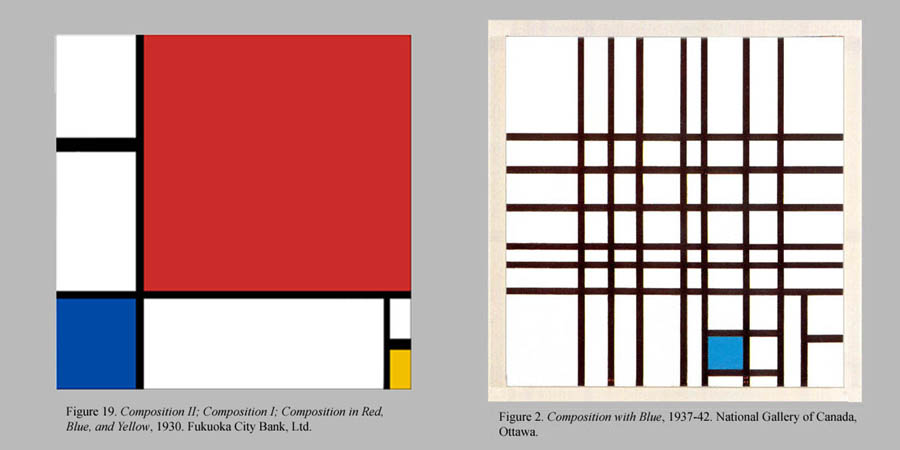
On this point Mondrian offers the following comment, alas without elucidation of any kind: "As painting has already demonstrated, a minimal color area often suffices to produce equilibrated relationship with noncolor..." N-PAF 197. So far as I have been able to find commentators offer neither elucidation of this sort of equilibrium nor an exhibition of good and bad examples of color/non-color balance. 17Yet the problem is glaringly obvious. Cumulatively the problems boil down to this: do Mondrian's works exhibit any equivalence fairly describable in these terms? and if they do, what ranking of designs by degree of equivalence along those dimensions is involved?
V. Testing intuitions of balance
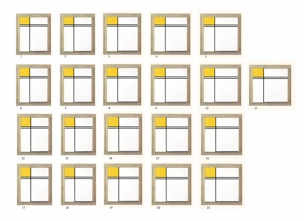
It seems clear what is needed at a minimum for testing all such claims. An equivalence may or may not be reducible to an objective ratio but it certainly has to be capable of being exhibited in an ordered progression of examples. This is the bedrock presupposition of all claims about balance. Their validity depends absolutely on the possibility of ranking actual and possible designs in terms of the equivalence in question. Until recently this has not been easy to put into practice. Now digitizing reproductions permits us to vary the designs endlessly with a few simple operations. By producing ordered sets of variations custom-tailored to a given balance thesis, we can put proponents of the thesis in the best possible position to elucidate to us, and perhaps to discover for themselves, the equivalence they obscurely intuit. For their intuitions can now be concretely embodied in a progressive way. For example, consider the ordered set of variations upon Figure 3 contained in Plate 1. Here one can compare designs in the most minute and immediate way. Distinctions which cannot possibly be discerned without simultaneous comparison in a suitably articulated set become comparatively clear, just as color-distinctions do by similar comparisons (think how impossible it would be to place samples in the color solid without simultaneous comparisons). Intersecting sequences allow us to dwell upon relationships aesthetically perceived, coaxing out subliminal responses so that they rise above the threshold of consciousness. And further such display facilitates exchange of impressions among viewers. 18
Plate 1 is offered only as a thumbnail indication of a proper test instrument. The reproductions need to be much larger than is possible in this format while preserving the arrays for multiple (nearly) simultaneous comparisons.
What's the lesson? The lesson is that we must exploit digital technology to
the full and set Mondrian's designs into the relevant space of possibilities
if we are ever to put judgments of aesthetic balance on a firm footing –
which at present they are clearly not. My experience suggests the process is
extraordinarily arduous and the outcomes from case to case are uncertain. But
that is what one would expect in any genuinely empirical investigation. On the
constructive side stands the possibility of our developing perceptions which
are sharper, more stable, and more reliably communicable than any we have hitherto
achieved. And beyond that lie more general possibilities of clarifying and in
due measure validating aesthetic properties at large. 19
Footnotes
1. Neo-Plasticism does not mean symmetry but constant contrasts." DWTH 191; "the equilibrium in the new art is not a static state without action, as is generally thought but, on the contrary, a continuous and mutually annihilating opposition of equivalent but unequal elements." NANL, 252; "dynamic equilibrium" PAPA 294.
2. Mondrian was far from modest about the content of his compositions: "What art makes us see and feel by this [purely plastic] expression is...beauty, truth, goodness, grandeur, and richness – the universe, man, nature...universal equilibrium." NANL, 251.
3. Even lines very rarely divide compositions equally either vertically or horizontally: exceptions are cat. 135 (1932). Equally rare are segmented columns of planes centered vertically, as in cat. 151 (1937-42) and cat. 88 (1920). The several grid compositions of 1918-9 fall outside of the comparison-class.
4. Harry Cooper observes (personal communication) that generally the black lines seem to lie slightly below the level of the planes they border or traverse.
5. Commentators concur: e.g. Jaffé: "The subtlety
of Mondrian's feeling for compositional equilibrium appears in many details...that
...[make]... it possible...to attain perfect equilibrium and harmony" (148)
Regarding fine adjustments, recent studies show that the artist made numerous
alterations in works which remained in his studio for a significant time. See
Cooper and Spronk for many intriguing examples of alterations great and small,
many made after the initial public exhibition.
6. Mondrian argues for the importance of such an orientation: "...man's eye is not yet free from his body. Vision is inherently bound to our normal position." H-S-C 210.
7. A regular grid, in contrast, though it lacks a dominant form, poses no problem because the center of the whole serves by default as the natural focus. Mondrian's classic works deliberately avoid such regularity and are not organized around a center. See Gregory Schufreider, "Overpowering the Center: Three Compositions by Mondrian," JAAC XLIV, 1, 13-28, and Rudolf Arnheim, The Power of the Center, 1988, pp. 104-107.
8. The position of the yellow plane above or below the double line also has an effect, I believe. When below the yellow plane seems more a solid object, more figure against a ground, than it does when above. In B136Y the effect is reinforced by the bounding line at the bottom. In B136 the yellow plane seems no more substantial than the white planes (quasi-representational consubstantiality).
9. Sources searched for commentary include: Yve Alain Bois, "The Iconoclast," in Piet Mondrian (1995); Carel Blotkamp, Mondrian: The Art of Destruction (1995), Kermit Swiler Champa, Mondrian Studies (1985); Robert Welsh, The Place of "Composition 12 with Small Blue Square" in the Art of Piet Mondrian, Bulletin of the National Gallery of Canada 29/1977. Of course this is but a small fraction of the total, but it is representative.
10. The sole complaint about imbalance in any of Mondrian's works I have found is that of Yve Alain Bois (Bois, 347) when he speaks of two works of 1922 (cat. 100, 101) as being ‘"top-heavy".' Even here the scare quotes leave his meaning less than perfectly certain. Composition 1 (1931), reproduced in Pagé et al as figure 141, p. 260, is also arguably bottom-heavy.
11. On the (normal) nonequivalence of strongly asymmetrical designs and their mirror images in respect of balance, see Arnheim (1954/1966) 22-24. Analyses of the difference of artistic effect in selected art works are given by Gaffrom (1950). Empirical studies, overall somewhat indicisive, have distinguished various factors influencing impressions of balance and overall preference for a given orientation (e.g. Freimuth and Wapner, 1979 and McManus, Edmonston and Rodger, 1985). I need not assume that such designs are never balance-equivalent to their mirror-images to find the cases in Mondrian's oeuvre puzzling. Likewise the difference of balance need not normally be great. It is enough that it be noticeable in a substantial majority of cases and yet not be noticeable in the cited works. My contention is merely that the apparent equivalence constitutes reason to doubt the exactness of our balance-discrimination.
12. Here I assume that aesthetic perceptions are genuinely cognitive (and in fact I believe they are subject to criteria of accuracy significantly similar to those applying to perceptions of color). This supposition is, to say the least, a controversial one, which is quite impossible for me to defend on this occasion, or even to properly elucidate. However, the claims concerning aesthetic equilibrium in the standard commentaries are put forward as genuine perceptions and not as reports of personal impressions. My procedure is therefore in full accord with common practice. It should go without saying that I do not claim to be infallible. More interestingly, I believe that conformity with the consensus of maximal discriminators of balance under optimal balance-discriminating conditions is a necessary condition of the genuineness of a perception of balance; and correspondingly for that of any other aesthetic property.
13. This grossness would not, in my view, disqualify perceptions of balance of validity, but just limit aesthetic balance properties to the range of the best human capabilities.
14. Here I must take exception to sentiments such as those of Jerrold Levinson when reflecting upon Mondrian's Composition with Blue (1933) in "Aesthetic Supervenience" (1990, p. 150): "Confirmation of the specific effectiveness of these features in the present case can be had by imagining alterations of them and trying to envisage the effect at the aesthetic level. There will invariably be such an aesthetic effect. It would not be the same painting, aesthetically speaking, if there were minor lapses from rectilinearity, if the blue square were darker in hue or less saturated, if the square or dominant vertical were exactly on-center, and so on." This presumption, a frequent one by aestheticians (moreso than by painters) does not survive the evidence of direct experience of paintings and relevant variations. Our imaginations are in fact constantly refuted by the relevant sort of direct experience.
15. Very often, I believe, Mondrian's paintings derive their cohesion from relationships of shape rather than balance. Thus in Composition with Blue the resemblance of shape between the blue plane and the canvas as a whole is a potent unifying feature which is lost when one substantially widens or narrows it. But more than anything I wish to stress how very little we know about the interactions of elements in Mondrian's type of work.
16. Granted Mondrian insists upon asymmetry, which is disanalogous to equality. But it is not certain that every contrasting pair must be "asymmetrical." Thus equality cannot be ruled out as a relevant form of balance for vertical and horizontal line length, or for color and noncolor, especially absent any other plausible ratio. Of course one can imagine that the desired sort of equilibrium of each dimension of contrast depends on the optimum sort of equilibrium of others, e.g., the planes. Another question pertinent to all the species of equilibrium in Mondrian's works (actually or aspirationally) is whether they are physically ("objectively") definable or rather are essentially phenomenal ("subjective"), matters of the way things appear to vision. I know of no systematic discussion of any of these questions in the literature.
17. See endnote 4 for tabulation of ratios for these two "equivalences" in a selection of Mondrian's oeuvre.
18. Anyone familiar with the Mondrian literature may wonder why I have not mentioned the claim, advanced e.g. by Rudolf Arnheim, that the designs are to be viewed as extracts from an indefinitely extended field of orthogonal forms (Arnheim, pp. 104-107), the whole tending toward "unfocused homogeneity." For this might well seem to exercise an influence on the viewer's impressions of balance. Yet close reading of Arnheim reveals that the latter is not his view, for he declares that the designs are "delicately balanced around the middle to give the composition the needed validity." (105) Since the experiments I have conducted seem to show that our impression of balance within a design is not affected by embedding it in a (suitably reduced) surround, I have not made an issue of the extensibility hypothesis. On the other hand I believe Arnheim is quite wrong about the implication of extensibility. In my view the reasons for holding that the works are properly viewed only as opaque, non-extensible surfaces are entirely decisive. Among these is the demonstrable inutility of trying to construct a relevant extension of given Mondrian design or trying to compose designs by creating such a field and then moving a frame over the surface searching for a Mondrian-like design. In my experience both processes soon declare their inanity. But at the same time I do not deny that intimations of spatiality figure in our experience of Mondrian's classic works.
19. See endnote 6 for a sketch of the bearing of the method proposed here on aesthetic properties at large.
References
1. Mondrian's writings
Piet Mondrian, The New Art – The New Life: The Collected Writings of
Piet Mondrian, edited and translated by Harry Holtzman and Martin S. James,
1986 (Boston: G. K. Hall & Co.) . Cited works are the following, headed
by the abbreviations used in the text.
DWTH: Down with Traditional Harmony! (1924)
H-S-C: Home – Street – City (1926)
NANL: The New Art– The New Life: The Culture of Pure Relationships
(1931)
N-PAF: The Neo-Plastic Architecture of the Future (1936)
PAPA: Plastic Art and Pure Plastic Art (1936)
Piet Mondrian, Mondrian: From Figuration to Abstraction, 1987, ed. Herbert Henkels. Tokyo: Tokyo Shimbun. Catalogue of an exhibition with extensive excerpts from Mondrian's published writings and letters.
2. Books and articles
Rudolf Arnheim, Art and Visual Perception: A Psychology of the Creative Eye, 1954. Berkeley, California: The University of California Press.
Rudolf Arnheim, The Power of the Center: A Study of Composition in the Visual Arts (the new version), 1988. Berkeley, California: The University of California Press, esp. "Mondrian Overrides Centricity,"104-107.
Carel Blotkamp, Mondrian: The Art of Destruction, 1995. New York: Harry N. Abrams. A major study of Mondrian's art.
Yve Alain Bois, "The Iconoclast," in Yve Alain Bois, Angelica Z.
Rudenstein, Joop Joosten and
Hans Janssen, Piet Mondrian 1872-1944, 1994. Boston/New York/Toronto/London:
Bulfinch Press (Little Brown and Company). Catalogue of a major retrospective
exhibition in 1995-1996.
All the paintings referred to in this paper are reproduced in this book.
Kermit Swiler Champa, Mondrian Studies, 1985. Chicago: University of
Chicago Press. A
somewhat more adventurous study, the usefulness of which is lessened, in my
estimation, by a fondness for obscure or idiosyncratic descriptions.
Harry Cooper and Ron Spronk, Mondrian: the Transatlantic Paintings, 2001. Cambridge, Mass. and New Haven, Conn.: Harvard University Art Museums and Yale University Press.
Harry Cooper, Dialectics of Painting: Mondrian's Diamond Series, 1918-1944, Ph.D. dissertation, Harvard University, 1997. Contains by far the most detailed, substantive discussions of Mondrian's compositions I have found in the literature, including some interesting, but to my mind problematic, procedures for demonstrating equilibrium within certain dimensions.
Marilyn Freimuth and Seymour Wapner, "The Influence of Lateral Organization on the Evaluation of Paintings," British Journal of Psychology, 70 (1979), 211-218.
Mercedes Gaffron, "Right and Left in Pictures," Art Quarterly 13 (1950), 312-331.
Herbert Henkels, 1987. Essays on Mondrian's life and artistic practice in Mondrian: From Figuration to Abstraction (see listing in 1).
Hans L. C. Jaffé, Piet Mondrian, n.d. New York: Harry N. Abrams. Contains the most explicit published references to equilibrium in particular works, but always in a complimentary vein, without analysis or comparison.
Joos Joosten, Robert Welsh et al, Piet Mondrian: Catalogue Raisonné,
1998. New York: Harry N.
Abrams.
Jerrold Levinson, Music, Art, and Metaphysics: essays in philosophical aesthetics, 1990. Ithaca and London: Cornell University Press.
I. C. McManus, D. Edmundson, J. Rodger, "Balance in Pictures," British Journal of Psychology, 76 (1985), 311-324.
Pagé, Suzanne et al, De Van Gogh à Mondrian: la beauté exacte: art, Pays-Bas, XXe siècle, 1994. Musée d'art moderne de la ville de Paris.
Gregory Schufreide, "Overpowering the Center: Three Compositions by Mondrian," JAAC XLIV, 1 (Fall 1985), 13-28.
Robert Welsh, "The Place of ‘Composition 12 with Small Blue Square' in the Art of Piet Mondrian," in Bulletin , The National Gallery of Canada, 29 (1977). Ottawa: The National Gallery of Canada.
3. List of Illustrations . Works of Piet Mondrian unless otherwise noted. The number following the title is the catalogue number in Yve Alain Bois et al, Piet Mondrian 1872-1944.
Figure 1. Tableau No. IV; Losenge Composition with Red, Gray, Blue, Yellow and Black, c. 1924/1925. 56 1/4 x 56 in. National Gallery of Art, Washington, D.C. (108)
Figure 2. Composition No. 12; Composition with Blue, 1937-42. 24 3/8 x 23 7/8 in.National Gallery of Canada, Ottawa. (150)
Figure 3. Composition with Yellow and Double Line, 1932. 17 7/8 x 17 7/8 in. The Scottish National Gallery of Modern Art, Edinburgh. (136)
Figure 4. Composition with Yellow, Blue, and Double Line, 1933. 16 1/8 x 13 1/4 in. Private Collection, Basel.(137)
Figure 5. Lozenge Composition with Two Black Lines, 1931. 31 ½ x 31/ ½ in. Stedelijk Museum, Amsterdam (131)
Figure 6. Lozenge Composition with Two Lines and Blue; Schilderij No. 1,
1926. 23 5/8 x 23 5/8
in. Philadelphia Museum of Art, A.E. Gallatin Collection (111)
Figure 7. Composition with Black, Red, and Gray, 1927. 22 x 22 in. Brandenburg Art Collections, Cottbus. (113)
Figure 8. Mirror-image transform of Figure 7.
Figure 9. Composition in White, Black and Red, 1936. 40 1/8 x 41 in.The Museum of Modern Art, New York. (147)
Figure 10. Mirror-image transform of Figure 9.
Figure 11. Composition of Lines and Color III; Composition with Blue, 1937. 31 ½ x 30 3/8 in. Haags Gemeentgemuseum, The Hague. (149)
Figure 12. Mirror-image transform of Figure 11.
Figure 13. Mirror-image transform of Figure 1.
Figure 14. Transform of Figure 1 (b/w color exchange between top and bottom planes).
Figure 15. Transform of Figure 3 (addition of blue plane).
Figure 16. Transform of Figure 4 (removal of blue plane).
Figure 17. Transform of Figure 1 (slide to the upper left).
Figure 18. Transform of Figure 9 (deletion of color).
Figure 19. Composition II; Composition I; Composition in Red, Blue, and Yellow, 1930. 20 1/8 x 20 1/8. Collection The Fukuoka City Bank, Ltd. (125)
Plate 1. Composition with Yellow and Double Line, 1932. 17 7/8 x 17 7/8 in. (as in Figure 3 above) and twenty variations upon it.
4. Endnotes
1. All transforms were produced via Photoshop 5.5 from reproductions in Yve
Alain Bois et al. I have leveled differences of size when works were to be compared
with each other. It should be realized that photographic reproduction does not
preserve the texture or the physical presence perceptible in the original painting.
My working assumption is that this deficiency does not affect equilibrium, but
of course that will need to be tested wherever it can be. Unquestionably the
obscuring of those aspects
promotes the misreading of Mondrian's works as containing optical space, on
which see note 15.
2. I have not discussed the small literature from experimental psychology directly
relevant to balance/imbalance in Mondrian's works, but only because of time
constraints. Aside from the studies cited in footnote 10, the most substantial
recent contribution is I.C. McManus, B. Cheema, J. Stoker, "The Aesthetics
of Composition: A Study of Mondrian," in Empirical Studies of the Arts,
11(2) 83-94, 1993. The authors prepared two transforms each for 25 classic Mondrians
by a formula that shifted lines retaining the work's topology, the shifts being
graduated in deviance from the original. Subjects were shown the exhibits in
pairs, the Mondrian paired first with the lesser, then with the greater deviant,
and the two transforms paired with each other, the order and position of the
items being randomized. Subjects (psychology and foundations of the arts students)
were told that one member of the pairs might be a Mondrian but that they were
to rate the members of each pair solely by degree of preference. Responses were
scored as correct if they preferred the Mondrian to the transform, and the lesser
to the greater deviant. In the event the students scored significantly higher
than a chance probability of correctness with respect to the Mondrian relative
to either transform, and somewhat less highly as to the two transforms relative
to each other. In some cases the preference for the Mondrian over the transforms
was very strong (e.g. 73%).
Interesting as it is, this experiment is limited by the transforms offered as alternatives to the Mondrians. The examples illustrated in the article suggest that the deviations were considerably grosser than any I have judged to be relevant to the present subject. Further, what is rated is preference in general, not balance in particular, although it may reasonably by presumed that balance played a part. Also, the population was only lightly backgrounded in the relevant ways. Somewhat unguardedly the authors conclude that the students are able to distinguish Mondrians from pseudo-Mondrians without qualifying this for the degree of difference of the latter from the former.
A modest number of other contributions to the wider subject are cited in the bibliography of McManus 1993. I consider all such contributions worthy of careful consideration. Any useful program of research into aesthetic properties must, in my view, combine philosophic, aesthetic and psychological expertise.
3. In the paper I give no procedure for detecting balance or imbalance beyond looking at the pictures and sensing balance or imbalance. I have supposed that the optimal test procedure must be the sort of looking that is universally thought to be appropriate for addressing the formal aspect of paintings. The novelty of my proposal lies exclusively in the systematic variations displayed simultaneously and the stress on deep backgrounding. The validity of my preference for what could be called canonical looking is by no means unassailable. Psychologists (McManus et al 1985) have used another method which certainly deserves systematic exploration by aestheticians. This is to place a wedge-form in the bottom margin of the reproductions and ask viewers to slide it right and left until it seems to be at the point where the painting seems perfectly balanced, i.e. not at risk of toppling in either direction. Photoshop is ideal for this. One creates a layer with the wedge at the right elevation and then slides it back and forth across the design (kept on the background layer) testing one's response. My preliminary trials of this method on the Mondrians and pseudo-Mondrians has elicited stronger intuitions of difference than I have been able to obtain from the classic direct contemplation. The problem is that the "fulcrum" test, as I will call it, seems to induce a way of experiencing the works different from the preferred way among current among specialists in abstract art. With the wedge seeming to support the painting, the latter is perceived as a configuration of three-dimensional physical elements, the lines and planes being seen as parts of a scaffolding, e.g. This is not at all obviously the appropriate way to view a Mondrian. When I view a Mondrian in the classic way, such quasi-pictorial reading is deliberately avoided. The open areas often offer a focus of potential interest that seems to balance more congested areas, in contradistinction to the physicalistic way of seeing the work. The asymmetry of the design, which will register as out-of-balance by the fulcrum test, seems in-balance relative to that way of experiencing it.
Notwithstanding this question mark, it seems obvious that systematic investigation of appropriate sort of balance, whatever sort that be, must consider all ways of experiencing the works that may conceivably have an effect on it, as seems likely to be the case with the fulcrum mode.
4. Fuller discussion of equivalence of verticals/horizontals and color/non-color.
1) Horizontal and vertical lines. It is clear that the ratio of vertical-to-horizontal line-lengths is unequal in many of Mondrian's works. Conceivably other factors than line length figure into the "real equivalence" to which he refers. Most plausible would be the thickness of the lines. Also it may be the appearance of equal length rather than the objective fact that is meant (it is well known that verticals appear somewhat longer than horizontals of equal length). Also, the shape, size and disposition of the planes bordered by the lines could conceivably have an effect, as could the place of the line in the painting: high/low, right/left, etc. No elucidation of the intended equivalence is offered by the artist or commentators. The following table gives ratios of the verticals to the horizontals in a sampling of the orthogonal works from the period 1922-37/42. Measurements in centimeters are taken from the reproductions in Bois. An asterisk indicates an exceptionally thicker line in that dimension.
| Bois cat. number | verticals | horizontals | v/h ratio | format v/h |
| 99 | 22.4 | 24.7 | .91 | 1.04 |
| 100 | 33 | 27 | 1.22 | 1.60 |
| 101 | 31 | 31.7 |
.98
|
.98 |
| 102 | 29 | 38 | .76 | 1.01 |
| 103 | 21.5 | 25.5 | .84 | .87 |
| 106 | 24 | 31 | .77 | 1.03 |
| 113 | 13.5 | 23 | .59 | 1.00 |
| 114 | 14.5 | 20 | .725 | 1.50 |
| 117 | 21 | 21.5 | .98 | 1.04 |
| 119 | 13 | 20.5 | .63 | 1.27 |
| 121 | 16 | 17 | .94 | .99 |
| 122 | 16 | 16 | 1.00 | 1.00 |
| 125 | 14 | 15 | .93 | 1.00 |
| 126 | 14.5 | 15.9 | .91 | 1.00 |
| 127 | 15.8 | 17 | .93 | .99 |
| 128 | 11.3 | 14.5* | .78 | 1.00 |
| 130 | 23.5 | 27.3* | .86 | 1.51 |
| 136 | 11.1 | 29.4 | .38 | 1.00 |
| 137 | 10.4 | 27.3 | .38 | 1.22 |
| 139 | 34 | 12 2. | . 80 | 1.98 |
| 140 | 19.5 | 25.9 | .75 | 1.02 |
| 141 | 32 | 43.2 | .74 | 1.03 |
| 142 | 47.8 | 58 | .82 | 1.08 |
| 143 | 18.2 | 44.2 | .41 | 1.02 |
| 144 | 39.6 | 53.4 | .68 | 1.29 |
| 145 | 30 | 47.9 | .63 | 1.02 |
| 147 | 51.6 | 60.1 | .86 | .98 |
| 148 | 42.4 | 72.5 | .58 | 1.30 |
| 149 | 106.4 | 72.5 | 1.46 | 1.04 |
| 150 | 89.3 | 80.2 | 1.11 | 1.02 |
The ratio of vertical to horizontal (independently of thickness) runs from .38 to 2.8. Obviously we cannot suppose whatever equivalence there may be is equality, or any set ratio at all. If there is any equivalence of vertical to horizontal, it must result from the ratio of line lengths interacting with varying contexts in some undisclosed way. Against the chance that one of the relevant variables in the equivalence is the ratio of height to width of the canvas, I also give those ratios.
The most notable aspect of the ratios of the lines is the rarity of cases where the sum of the verticals exceeds that of the horizontals (in the orthogonal works, that is).Only three of the sample works favor the vertical so far as line length is concerned and of these only one, the quite exceptional cat.139, scores above 1.46 (indeed almost 2x it). Of the ten works with vertical formats, only cat. 139 and one other, cat. 100, scores above 1.00, whereas another, cat. 137, comes in at .38 (due to doubling). We may say that Mondrian generally feels the need of more horizontal line than he does vertical, although in 30 per cent (9) the difference is slight, less than 10%. One can imagine this taken as a reason for thinking that the greater subjective length of verticals to have figured in Mondrian's perception. But given the great variability of the actual ratios, it can have done so only weakly or inconstantly. This would hardly be surprising since it seems doubtful that viewers have sharp impressions of ratios of the sum of verticals to the sum of horizontals. The visual illusion concerning verticals is always cited in cases of individual segments rather than for sums of separated segments.
Interestingly the proportions of the format tend in the opposite direction,
for in general post-1921 Mondrian favors canvases that are of equal or greater
height compared with their width. Could this bias somehow balance the contrary
bias for line-length within the canvases?
2) Equivalence of color and non-color. Here we encounter another intractable non-equivalence. Non-color preponderates by a large margin, if we judge in terms of area. And there are glaring variations in the proportions, as the list below testifies. Indeed the only examples in our sample that come close to equality are cat. 100 and cat. 125, and these are the only works in the retrospective exhibition that do so. From this we might infer that Mondrian had something quite different in mind than equality of area. But it is hard to see what other meaning he might have had which could avoid refutation by the huge discrepancies among the ratios found in the works (.0026 compared with .59, for example). How could these disparities be consistent with equivalence of, say, effect or "force," as if the fully saturated reds, blues or yellows could be felt to exert the same force as the quiet strength of the non-color planes. Figure 10 can hardly be balanced in color/noncolor forcefulness if Figure 22 is, and vice versa.
Samples of color/noncolor area ratios (grays are counted as noncolor and works without color are not included):
| Low color | Medium color | High color | |||
| 154 | .0026 | 119 | .25 | 102 | .51 |
| 113 | .014 | 122 | .26 | 125 | .59 |
| 136 | .058 | 140 | .29 | ||
| 143 | .063 | ||||
| 137 | .079 |
It seems more likely that whatever color/non-color-balancing there is presupposes that a certain proportion suits some global aesthetic property of the individual work. That is, the work is desired to have either a more expansive, radiant character or a more tranquil, meditative one, and the color planes are trimmed to that governing overall character – il allegro, il pensieroso – such as is suggested by the remarks by Charmion von Wiegand quoted in Cooper and Spronk 145-6 about the delicacy and grace of cat. 150 (Figure 2 above) requiring the reduction of blue to a single small rectangle. Conceivably the disposition of lines also comes into the formula, so that one must collect the character of the work in part from them. If so, then the color ratio could be said to harmonize with the disposition of the whole. Only intensive exploration of the works, aspect by aspect, can disclose what if any genuine equivalences actually obtain. What seems certain is that few of the things said by the artist or by art historians to date gives us much enlightenment.
( It is of course essential not to confuse overall color/non-color equivalence with balance of colored planes within a painting, the red rectangle in a given place balancing the blue or yellow rectangles in certain other places.)
5. In Cooper and Spronk the excerpts from the unpublished journals of Charmion von Wiegand are remarkable for supplying aesthetic interpretations of a number of Mondrian's works. To the aesthetician they come like rain in a parched land. It is to be hoped that the journals are soon published and that art historians follow her lead, supplying an essential next stage in the analysis of Mondrian's achievement.
6. Aesthetic properties are famously hard to define, which is to say hard to clearly conceptualize. They are also plausibly sensitive to many variations in base properties. Both of these circumstances would seem to favor exploring our capacity to recognize different degrees of such properties in sequences of systematic variations produced by digital transformations. If such sequences were confirmed within given domains, the operation of base factors would necessarily be partly revealed and the project of elucidating the properties in question would be significantly advanced.
7. I gratefully acknowledge the advice received from Harry Cooper, Fogg Art Museum, in correcting and refining various aspects of this paper.
Addendum
In presenting this material I have sometimes found members of the audience who profess entire inability to experience (judge, feel) visual balance. I believe this indicates lack of confidence rather than lack of capacity. So I offer the following game as a device to break down the barrier. I think it should convince anyone of the accessibility of at least crude differences of visual balance.

Mondrian's Balance
John H. Brown, Department of Philosophy, University of Maryland, College Park,
MD 20742. Telephone: 301-405-5702. E-mail: jhbrown@umd.edu